
Bookworm App
A Personalised Book Discovery Experience For Modern Readers
Role - UX Researcher, Visual Designer
Jun 2024 - 2 weeks
Team size - 4 designers
Platform - Mobile app
Tools - Figma, FigJam, Google Forms
Readers felt overwhelmed by too many choices and struggled to find books that matched their interests efficiently.
Problem -
Outcome -
Streamlined the book discovery flow to reduce decision fatigue
Achieved 100% task completion in usability testing
Improved user confidence in selecting books through personalization
Bookworm is a personalized book recommendation app designed to help readers discover books they’ll actually enjoy, without wasting time or money on the wrong picks. The idea came from a real problem our team experienced as frequent readers: even with reviews and ratings, it’s still hard to know if a book will match your taste. We set out to design a user-centered platform that recommends books based on individual preferences, reading habits, and goals, making discovery feel faster, more confident and more enjoyable.
ROLES & RESPONSIBILITIES
ROLES & RESPONSIBILITIES
ROLES & RESPONSIBILITIES
As a core contributor, I was involved throughout the entire design process, collaborating closely with my team to bring our concept to life. My responsibilities included:
Conducting multiple user interviews to explore reading behaviors and pain points
Contributing to user research and synthesizing insights
Performing competitor analysis as part of a broader competitive audit
Co-developing the user persona, storyboard, and user flow
Sketching low-fidelity wireframes and developing them into mid-fidelity prototypes
Leading user testing sessions and conducting UI testing
Designing the full UI, including the style tile and high-fidelity mobile screens
PROBLEM STATEMENT
PROBLEM STATEMENT
PROBLEM STATEMENT
Many readers, especially those with limited free time, struggle to find books that match their tastes and deliver a rewarding experience. We believed that designing a personalized, user-friendly tool would help optimize their spare time and enhance overall reading enjoyment.
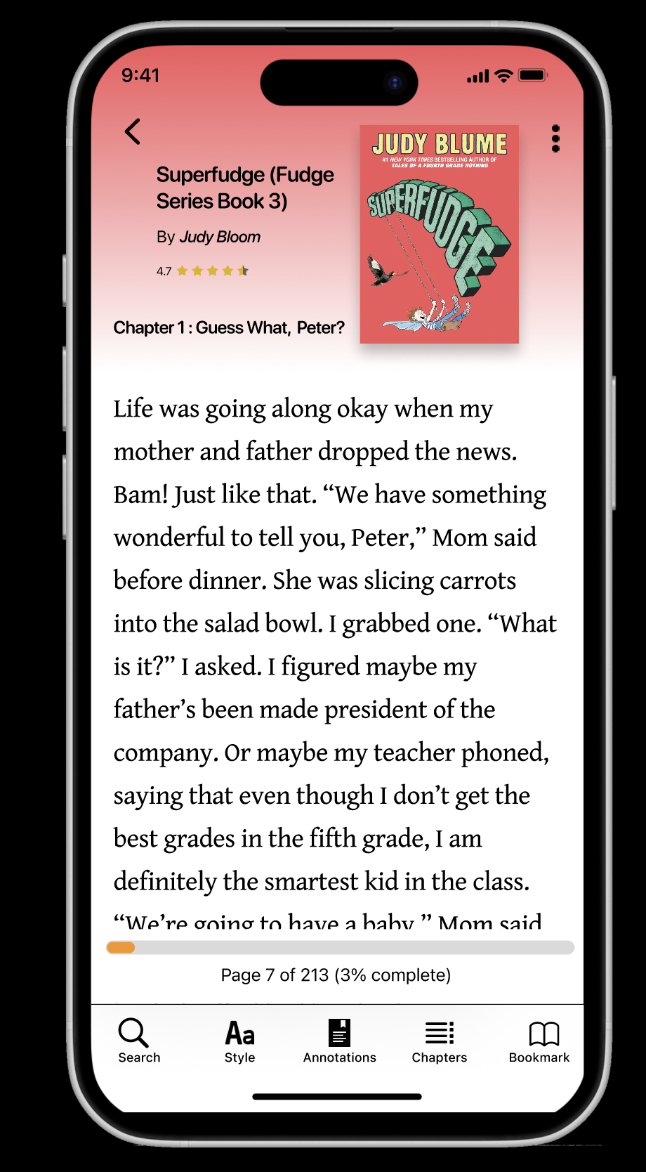
FINAL RESULT
FINAL RESULT
FINAL RESULT
Short on time? Here's a quick preview of the final design. Explore key screens like the Home, Audio Player, eBook Reader, and Author Page, all crafted to deliver a seamless and personalized reading experience.
Click here to jump to the final solution.
DESIGN PROCESS
DESIGN PROCESS
DESIGN PROCESS
Our UX design process for Bookworm was rooted in empathy and a shared love for reading. We began by researching common frustrations readers face, such as investing time and money into books that don’t match their interests. Through user interviews and surveys, we identified key pain points and reading habits. From there, we followed a user-centered approach by ideating solutions, developing prototypes, and refining them through user testing. Prioritizing accessibility and ease of use, we continuously iterated based on real feedback to create a personalized and enjoyable platform that helps readers confidently discover their next great book.
RESEARCH
RESEARCH
RESEARCH
Our goal was to understand:
How users engage with reading and their habits.
How they choose their next book.
The frustrations and challenges they face during this process.
Research Goals
Research Methods
We conducted five in-depth user interviews with readers of varying ages and reading preferences. Our approach prioritized qualitative feedback to understand user’s motivations, frustrations, and behaviors related to reading.
Synthesis and Key Insights
After collecting interview data, we organized our notes into an affinity diagram to identify common themes. We then distilled user quotes into key complaint areas.
Common Complaints
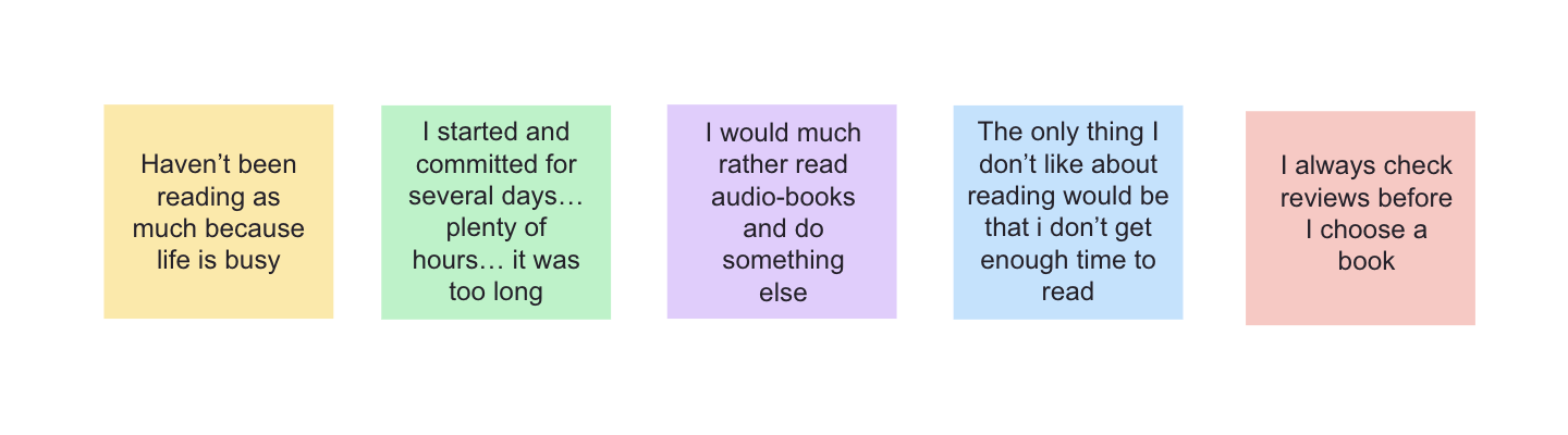
Time Constraints:
“Don’t get time to read enough”
“Haven’t been reading as much because life is busy”
→ Users crave reading but struggle to make time for it.
Overwhelming or Misaligned Content:
“I started and committed for several days… it was too long”
“Reading halfway through made me realize I didn’t agree with the book’s strategies.”
→ Readers want better book previews to avoid wasted time.
Desire for Multitasking Options:
“I would much rather read audiobooks & do something else.”
→ Flexibility matters—users want formats that fit into their busy lives.
Review-Dependent Decisions:
“I always check reviews before I choose a book.”
→ Readers are cautious and seek trusted recommendations before investing time.
EMPATHY MAP
EMPATHY MAP
EMPATHY MAP
To further personify our findings, we created an empathy map reflecting what users say, do, see, think & feel. This helped our team emotionally connect with the user experience and align around user-centered decisions.
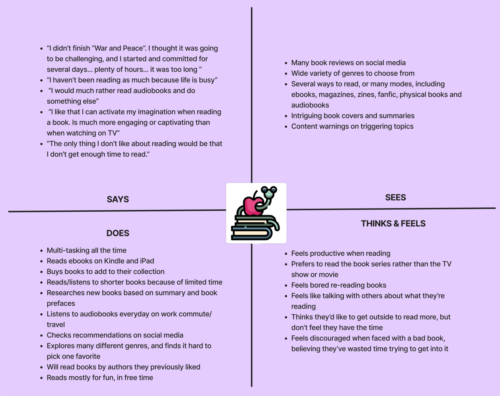
Gains
Reading helps users relax, learn, and stay mentally engaged
Reading before bed improves sleep quality
Books create social connection through discussion and sharing
Audiobooks make reading more flexible and accessible
Pains
Eye strain from screens or small print
Frustration from investing time in books that don't meet expectations
Overwhelm from too many options and dense content
Triggers from unexpected serious or controversial topics
USER PERSONA
USER PERSONA
USER PERSONA
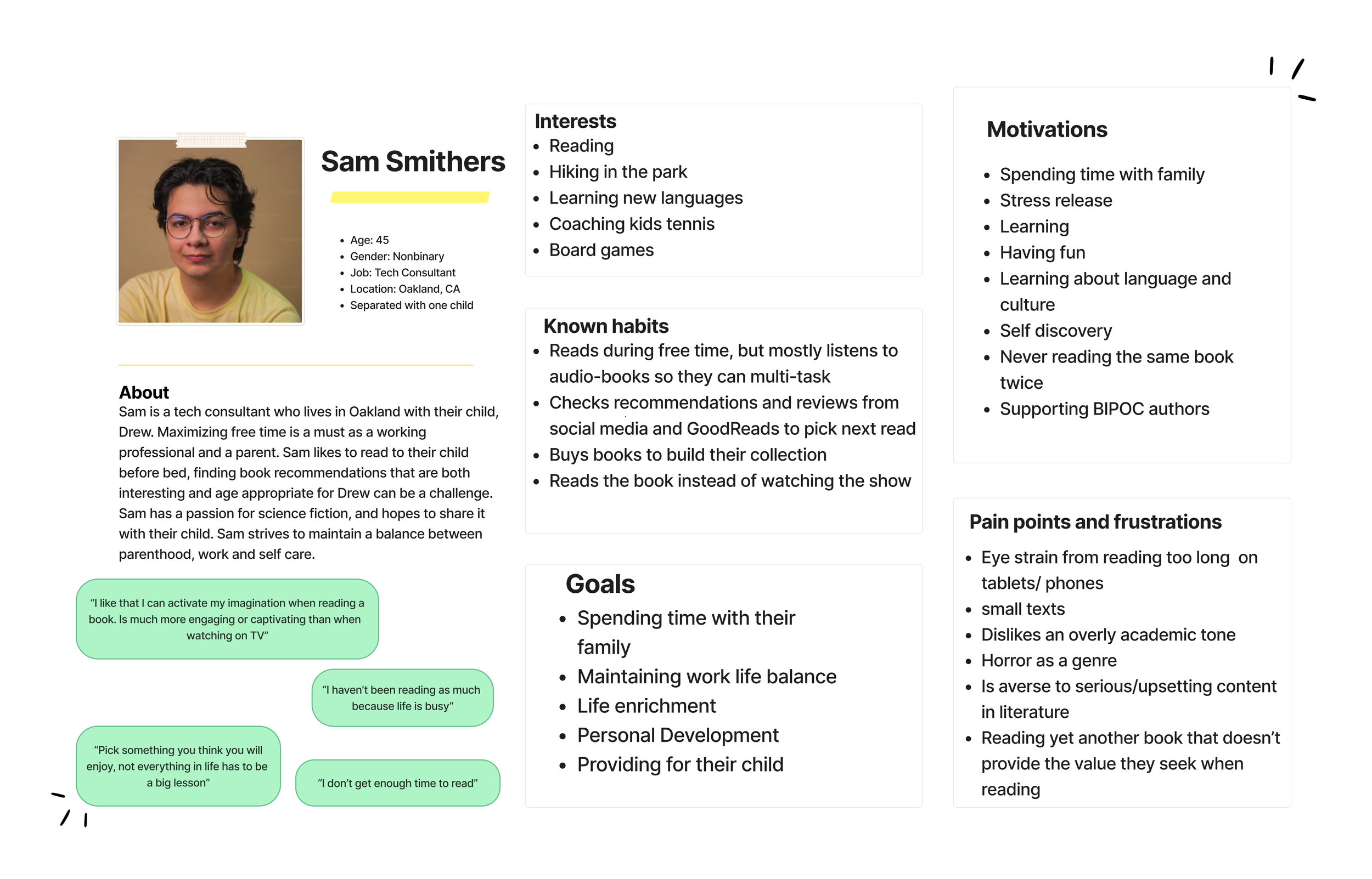
From our research, we developed Sam, a time-strapped, curious reader who often feels overwhelmed by the number of book options and limited free time.
Sam became our guiding light in prioritizing features like personalized suggestions, quick summaries, and audiobook integration.
USER FLOW & IA
USER FLOW & IA
USER FLOW & IA
Core User Flow: “Find and start a book I’ll enjoy”
Launch App →
Welcome screen with options to sign up or sign inOnboarding Quiz →
Short preference survey (genre, format, time availability)For You Page →
Personalized book list (audio + ebook formats)Book Details →
Summary, user ratings, average reading timeSave or Start →
Add to bookshelf or start reading/listeningDiscussion Forum →
Share thoughts or check community reviews
Using insights from user interviews and guided by our primary persona Sam, I created a streamlined user flow to simplify book discovery and reduce decision fatigue. The flow emphasizes quick access to personalized recommendations, flexibility between audio and ebook formats, and opportunities for social interaction.
User Flow
Information Architecture
The app features a bottom navigation bar with four primary sections, structured around the most important user needs:
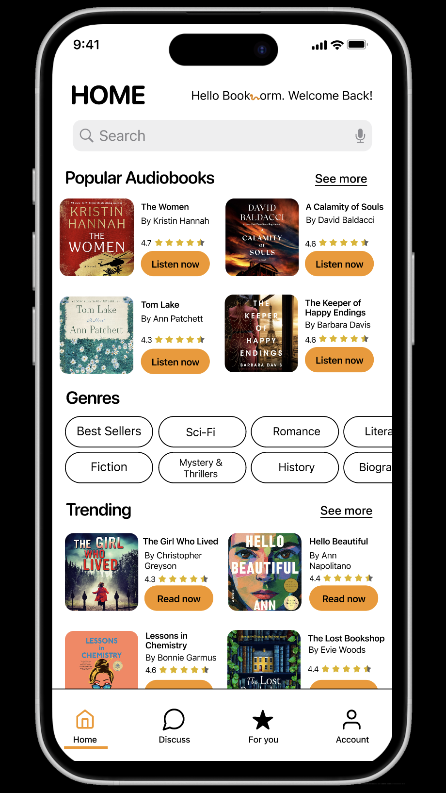
Home
Curated popular books & trending audiobooks—a starting point for discoveryForum
A discussion space to connect with other readers, post reviews, and explore community favoritesFor You
A personalized space with recommendations based on onboarding quiz results; shows both audiobooks and ebooks filtered to user preferencesAccount
User profile, saved reads, quiz retake option, and settings
This structure supports both new and returning users by balancing exploration, personalization, and community engagement,all with minimal cognitive load.
WIREFRAMES & PROTOTYPES
WIREFRAMES & PROTOTYPES
WIREFRAMES & PROTOTYPES
To design an intuitive and user-friendly app, I began by sketching wireframes on paper, focusing on accessibility and flow. These low-fidelity sketches allowed me to explore layout ideas and prioritize key user tasks.
I created wireframes for the following core screens:
Home screen: Highlighting popular and trending books & audiobooks
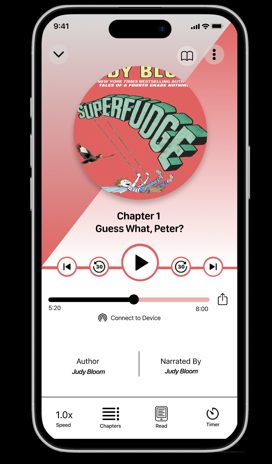
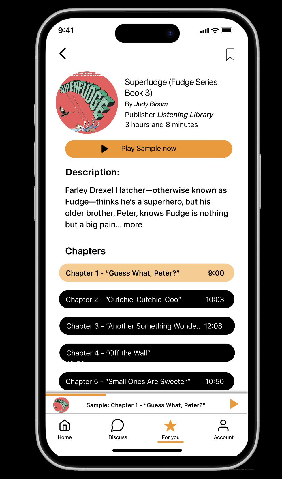
Audio Player & Details: A seamless interface to preview and listen to audiobooks
Ebook Reader: A clean, distraction-free space for reading
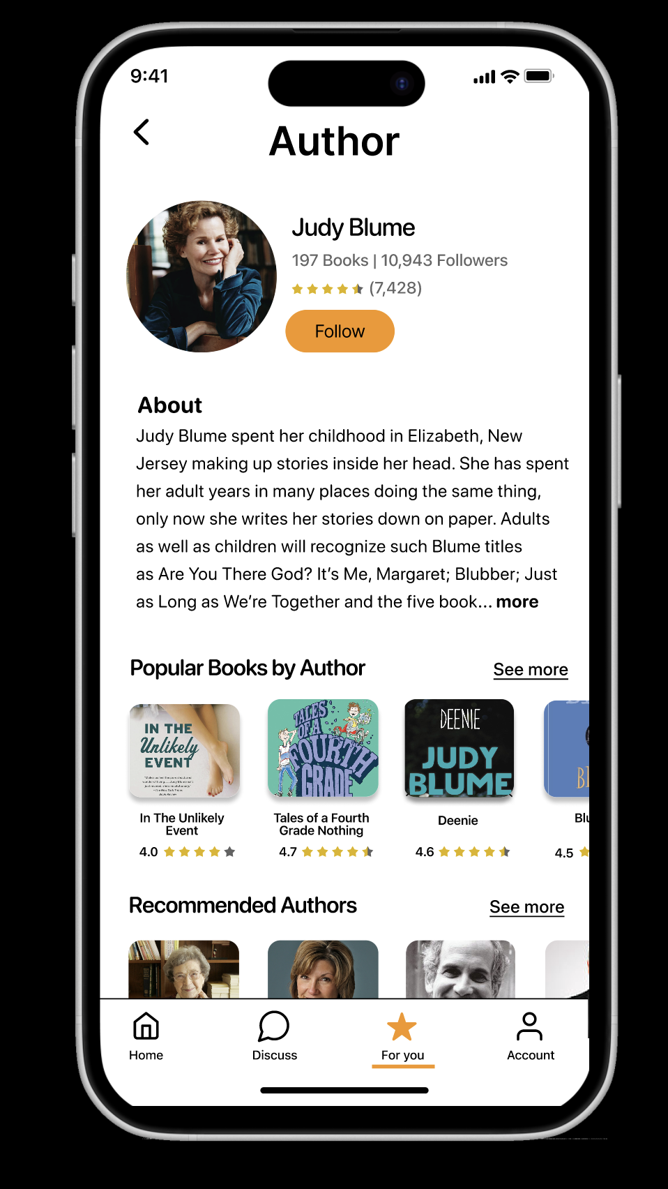
Author Page: Dedicated space with bio, other works, and follow/save option
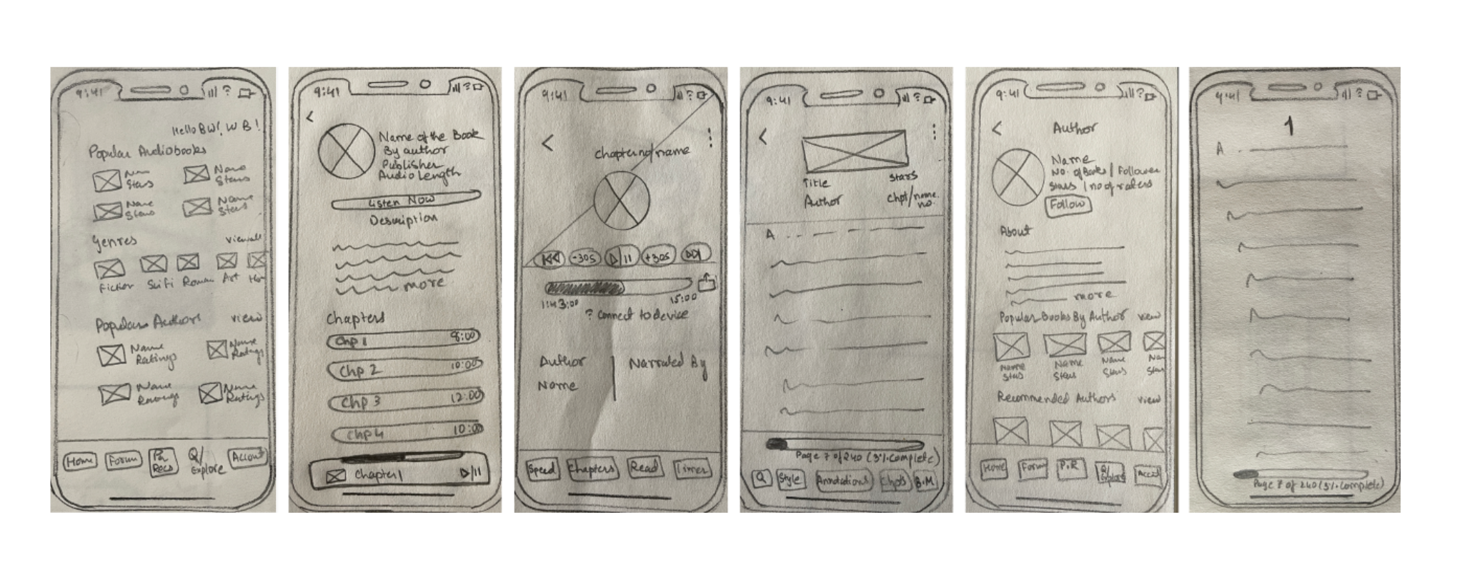
Sketches of Home screen, Audio(Details & Player), Ebook Reader, Author page
Once I was satisfied with the paper sketches, I translated them into digital wireframes and connected the screens into an interactive prototype using Figma.
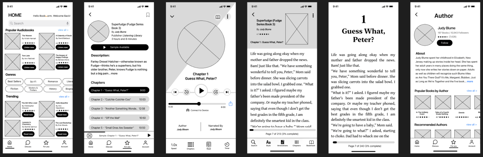
Mid-fidelity of Home screen, Audio(Details & Player), Ebook Reader, Author page
Usability Testing & Iteration
I tested the prototype with five individuals who completed two tasks:
Sample an audiobook
Find an age-appropriate book for a 10-year-old reader
All participants successfully found a book for a 10-year-old.
However, most users experienced confusion on the Audio Details screen, they were unsure if it was the player itself or just a chapter listing. The layout, particularly the bottom player bar and chapter list, caused hesitation.
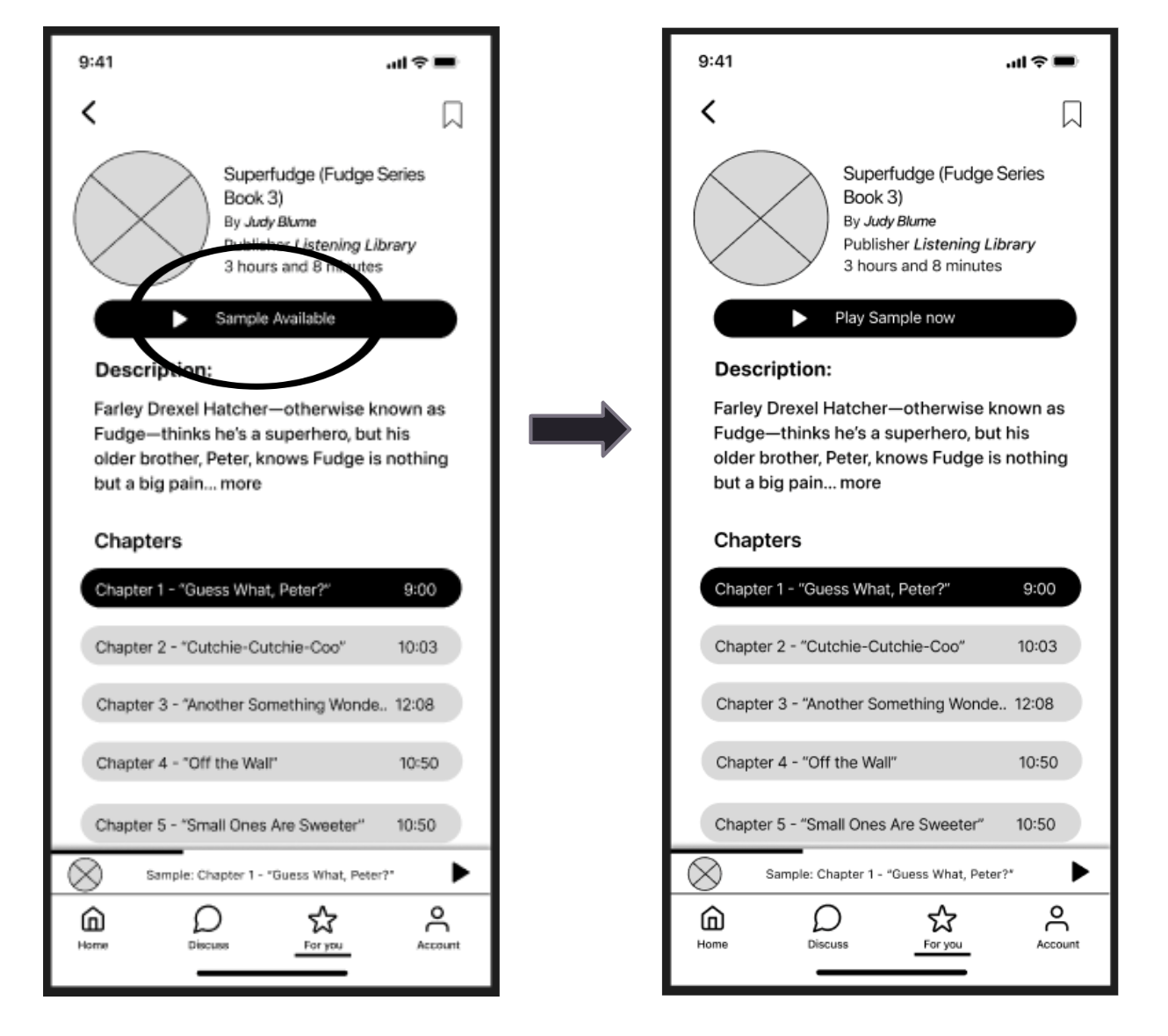
Design Iteration:
To resolve this, I changed the button label from “Sample Audiobook” to “Play Sample Now” to make the action clearer and more immediate.
This small wording change improved clarity and accessibility, helping users confidently engage with audio content.
VISUAL DESIGN
VISUAL DESIGN
VISUAL DESIGN
After refining the wireframes and iterating based on usability feedback, I moved on to high-fidelity design, focusing on creating a clean, engaging, and user-friendly interface.
The entire high-fidelity UI was designed by me, ensuring consistency in color palette, typography, spacing, and visual hierarchy across screens. I carefully selected elements that aligned with the reading experience - calm tones, intuitive icons, and readable fonts, to support a relaxing and functional environment.
The design emphasizes:
Visual clarity for ease of navigation
Consistent styling across all device sizes
Minimal distractions, allowing users to focus on reading or listening
From homepage to audiobook player, every element was intentionally designed to guide users smoothly through their journey.

SUMMARY
SUMMARY
SUMMARY
Even though there are many apps available in the market, people still struggle to find good book recommendations. I believe that by providing an all-in-one service, this app will help book lovers stick to one platform, saving them time. Additionally, having verified users will ensure high-quality recommendations, leading to less money wasted on unsatisfactory books.
Key Takeaways
Developing user personas helped me tailor the app to real user needs and preferences.
Conducting competitor analysis highlighted the market gaps and opportunities for more innovation in my app.
Small but meaningful changes based on user feedback greatly enhance user experience and accessibility.
Future Enhancement
Integrating book purchasing options for users
Integrating machine learning
AI-generated picture for more visual effects while reading
Integrating Language support
Gamification service
“Scheduled reading session” feature
REFERENCES & ACKNOWLEDGEMENT
REFERENCES & ACKNOWLEDGEMENT
REFERENCES & ACKNOWLEDGEMENT
I would like to express my sincere gratitude to everyone who played a role in bringing this project to life.
To my incredible team members: thank you for your collaboration, creativity, and unwavering support throughout every phase of the design journey. Your contributions made this project both impactful and enjoyable.
To the users who generously participated in interviews, surveys, and usability testing: your honest insights were invaluable. Your voices helped shape a more thoughtful, user-centered experience.
I also want to acknowledge the inspiration and guidance drawn from industry thought leaders and resources including Nielsen Norman Group articles, The Design of Everyday Things, Lean UX, and Design Thinking. Tools like Figma, Adobe Creative Suite, and Canva played a vital role in bringing this vision to life.
This project is a reflection of collective effort, learning, and shared passion. I’m truly grateful to each one of you.
Done Scrolling? Not Yet 😉
Take a peek at more of my design adventures below.