
San Jose Candy Kitchen
Redesigning a local business website to improve discoverability and direct sales

Project Summary
Project Type:
Small BusinessMy Role:
UX/ Product DesignerTimeline:
4 weeksTeam size:
3 Designers including meOutcome:
Prototyping, wire-framing, user flows, low to hi-fi mockups, component creation, information architecture, interaction design, visual design, storyboards, stakeholder and user interviews, usability testing, card sorting and 5-second testingDeliverables:
Figma, FigJam, Google Suite, Adobe Creative Cloud, Miro, Trello, CanvaTools:
Customers struggled to navigate the existing website, understand product offerings and confidently place orders, leading to reliance on third-party delivery platforms.Problem:
Improved product discoverability through clearer navigationIncreased user preference for ordering directly from the websiteEnhanced alignment between business goals and user needs
San Jose Candy Kitchen is a family-owned candy shop in downtown San Jose known for its handcrafted sweets and welcoming in-store experience. While the brand shines in person, the existing website made it difficult for customers to browse products, understand offerings or take key actions such as visiting the store or placing an order.
I led a four-week website redesign with a three-person team, partnering closely with the owner to modernize the experience and improve usability across devices. As the primary stakeholder contact, I supported user research and led the UI design, delivering a responsive website that better reflected the brand and made key information easier to find.
Redesign the San Jose Candy Kitchen website to improve product discoverability, simplify navigation and make key actions such as visiting the store or placing an order easy and intuitive across devices.The Goal
User struggles with confusing navigation, tedious sign-up processes, and unengaging visuals when shopping for sweets online. These usability issues create frustration and reduce their likelihood of returning, highlighting the need for a more intuitive and enjoyable shopping experience.The Problem
Research & Planning
We began our discovery phase with a simple question:How do people shop for sweets online?We surveyed 50 participants to understand shopping preferences and behaviors.84.6% of respondents preferred ordering directly from a business’s website, rather than using third-party platforms like Etsy or DoorDash.This insight validated the stakeholder’s concern that the existing website was underperforming and missing opportunities for direct customer engagement.
To deepen our understanding, we conducted user interviews, uncovering the motivations, expectations and decision-making behaviors behind these preferences.

Key Findings from User Interviews
User interviews revealed what truly influences trust and decision-making when shopping for sweets online.One participant noted, “A poor website layout is a red flag for me,” highlighting how strongly users associate clean, intuitive design with credibility.Another shared, “Imagery is vital,” emphasizing the emotional impact of high-quality, authentic product visuals.
Recurring User Expectations
Users rely heavily on reviews to guide purchasing decisions.They expect clear and timely order updates once an order is placed.They want a seamless, user-friendly experience that reflects the quality and care of the product itself.These insights shaped our design strategy, guiding decisions around layout structure, visual hierarchy, and product presentation to build trust, highlight the brand’s charm, and make ordering feel effortless and enjoyable.
User Persona

After conducting interviews and analysing user insights, we created a user persona that captured the core needs and behaviours of our target audience.Tanya Shah, our primary persona, guided key decisions throughout the website redesign. Her goals and frustrations helped us stay focused on creating a more engaging and user-friendly experience that aligned with real user expectations.Empathy Map
To further deepen our understanding of our users, we created an empathy map based on insights gathered from the survey, interviews, and key findings. Focusing on Tanya, our primary user persona, this map helped us visualize what she is thinking, feeling, saying, and doing during her experience with online sweet shopping platforms. By mapping her emotional and behavioral patterns, we identified core pain points and motivations, which ultimately led us to define our problem statement and focus our design efforts around real user needs.


User Flow
We streamlined the current task flow to enhance usability and make it more intuitive and user-friendly. By simplifying key interactions, we aimed to help users navigate the purchasing process with greater ease, resulting in a smoother and more efficient overall experience.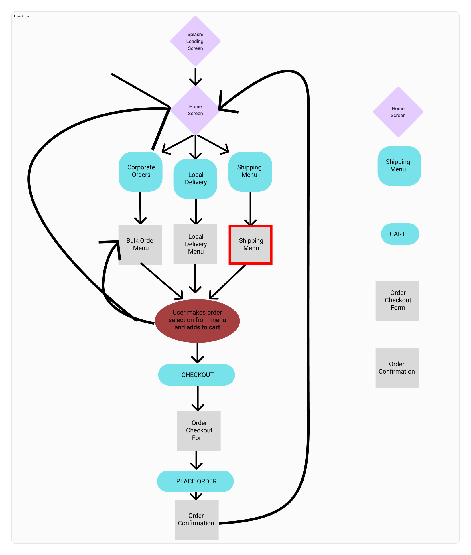
Insights from Stakeholder
During the stakeholder interview, I discovered that the existing website was receiving little to no traffic, with most orders coming through third-party platforms like Etsy and DoorDash. The stakeholder expressed a strong interest in building a more direct connection with customers. I proposed that my team design a new, user-centred website to help drive more organic traffic and reduce over-reliance on external platforms. This approach would support a more independent online presence while still allowing the business to benefit from its existing partnerships.Design Evolution
After understanding the problem, our team created initial sketches to map out key interactions and identify the ideal journey for our users. With the help of the user flow developed by the team, I took the lead in developing the mid-fidelity wireframes. This phase allowed me to refine the layout, structure, and functionality, ensuring our design addressed user pain points and aligned with both user needs and project goals.We wanted to introduce a fresh and approachable solution to improve product discovery on the website. Instead of using a traditional scroll-down format for categories, one of my teammates proposed showcasing them directly on the homepage. I immediately brought this idea to life in the mid-fidelity wireframes, designing a clean, interactive layout. To enhance clarity and engagement, I incorporated subtle hover effects for each category, making the experience more intuitive and visually appealing.
Initial Mid-fi wireframe

Final Mid-fi wireframe after iteration
To validate the effectiveness of this feature, we conducted a usability test, asking users whether this categorized layout helped them find products faster. The feedback was overwhelmingly positive; users found the section intuitive, easy to navigate and appreciated the quick access to product types without excessive scrolling.High Fidelity Wireframe
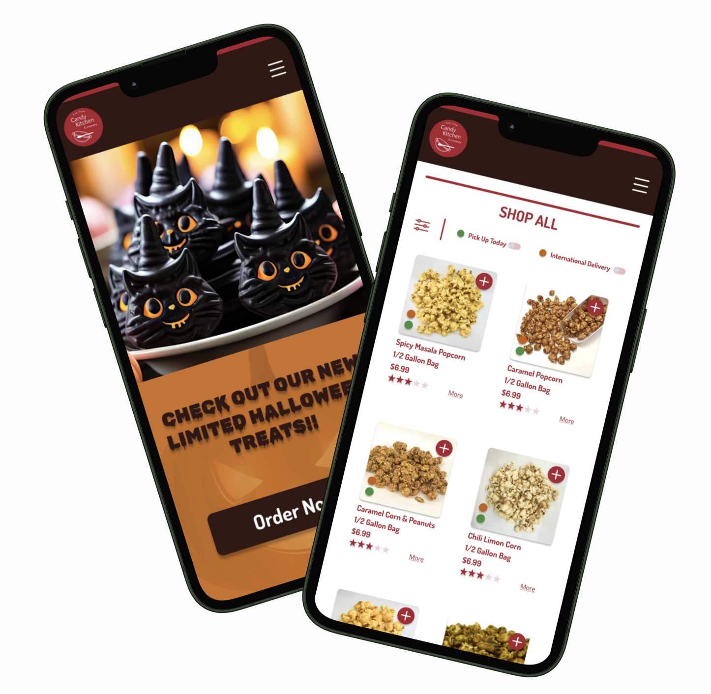
Once we were satisfied with the mid-fidelity wireframes and had integrated user feedback, we transitioned to developing the high-fidelity designs. As a team of three, we divided responsibilities: one teammate focused on creating the style guide and mood board, another conducted usability tests to validate our design decisions and helped me in designing the pages, and I took the lead in designing the main website pages as well as the complete set of mobile wireframes.We continuously conducted and relied on usability tests to keep our work highly user focused. These insights allowed us to iterate on the high fidelity designs based on our users’ needs and feedback, ensuring the final product was both intuitive and effective. You can see the difference in the images below, which compare the original website to our redesigned version, highlighting improvements in layout, clarity, and overall user experience.Before

Original Website Homepage
Homepage
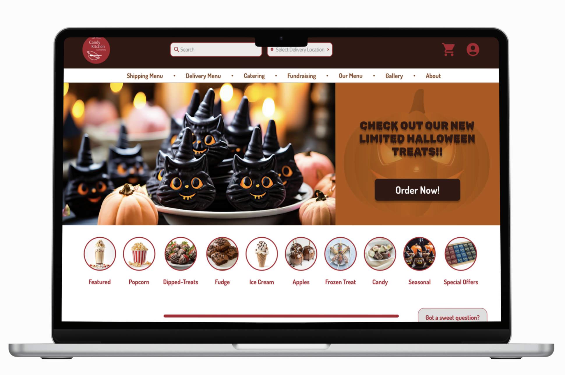
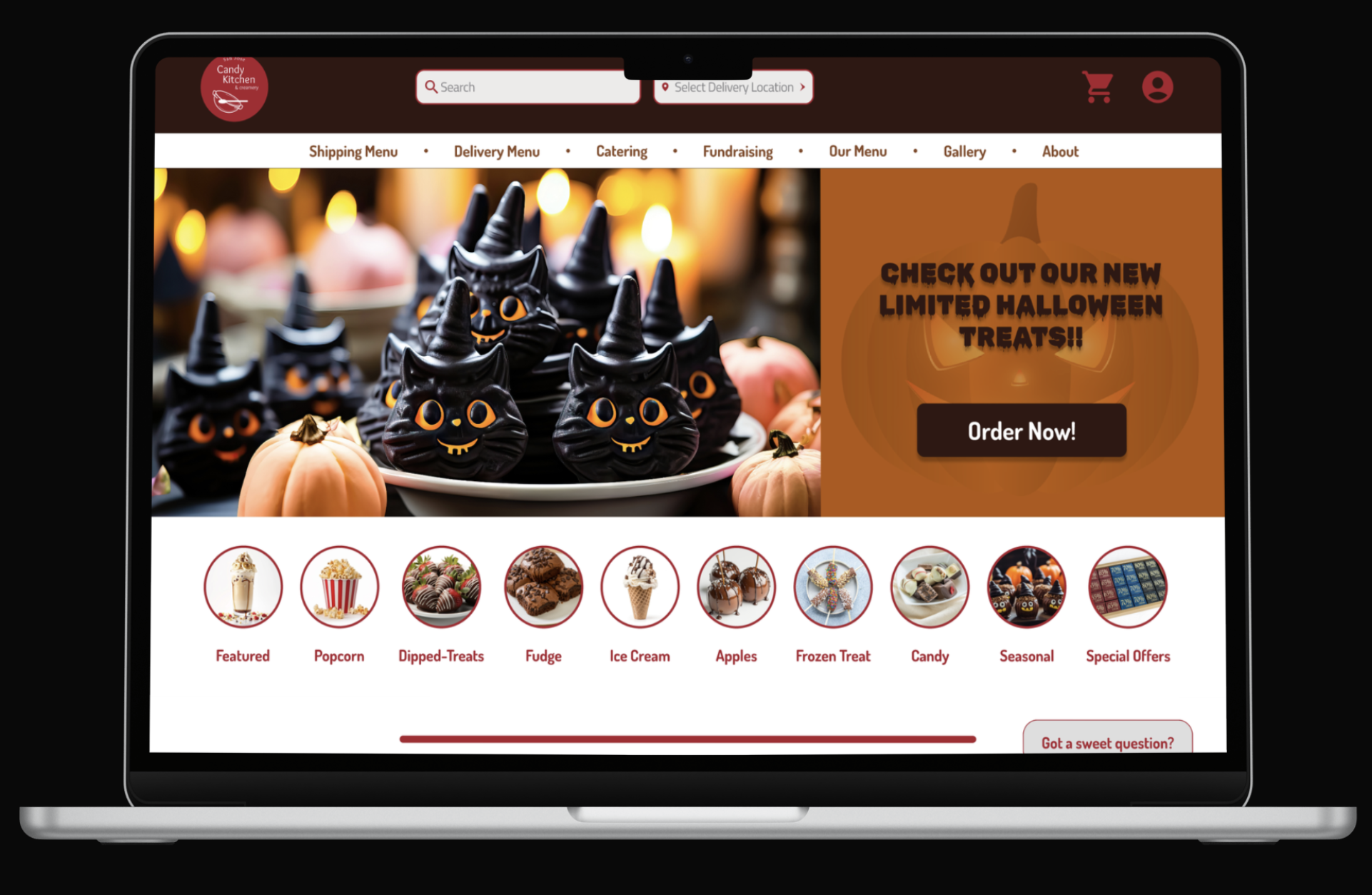
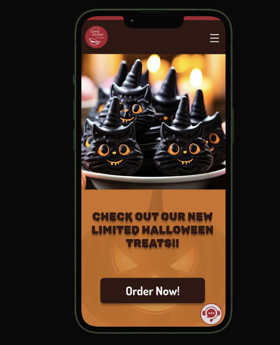
After
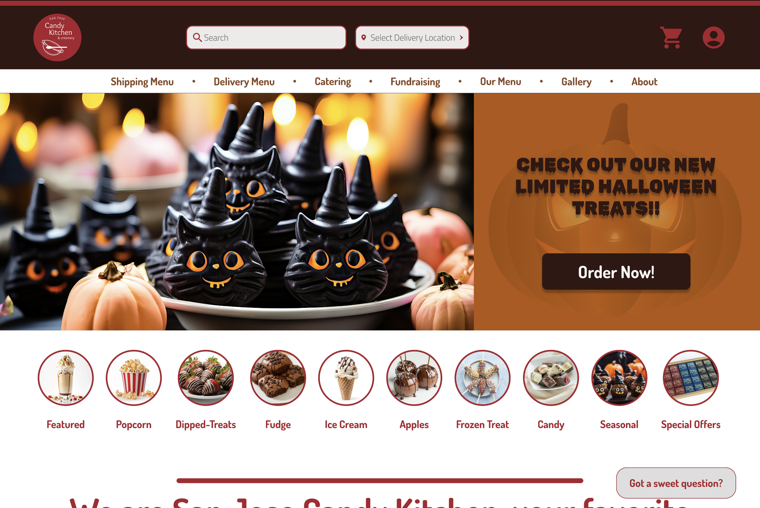
Redesigned Homepage
Original Website Shipping Menu
Shipping Menu
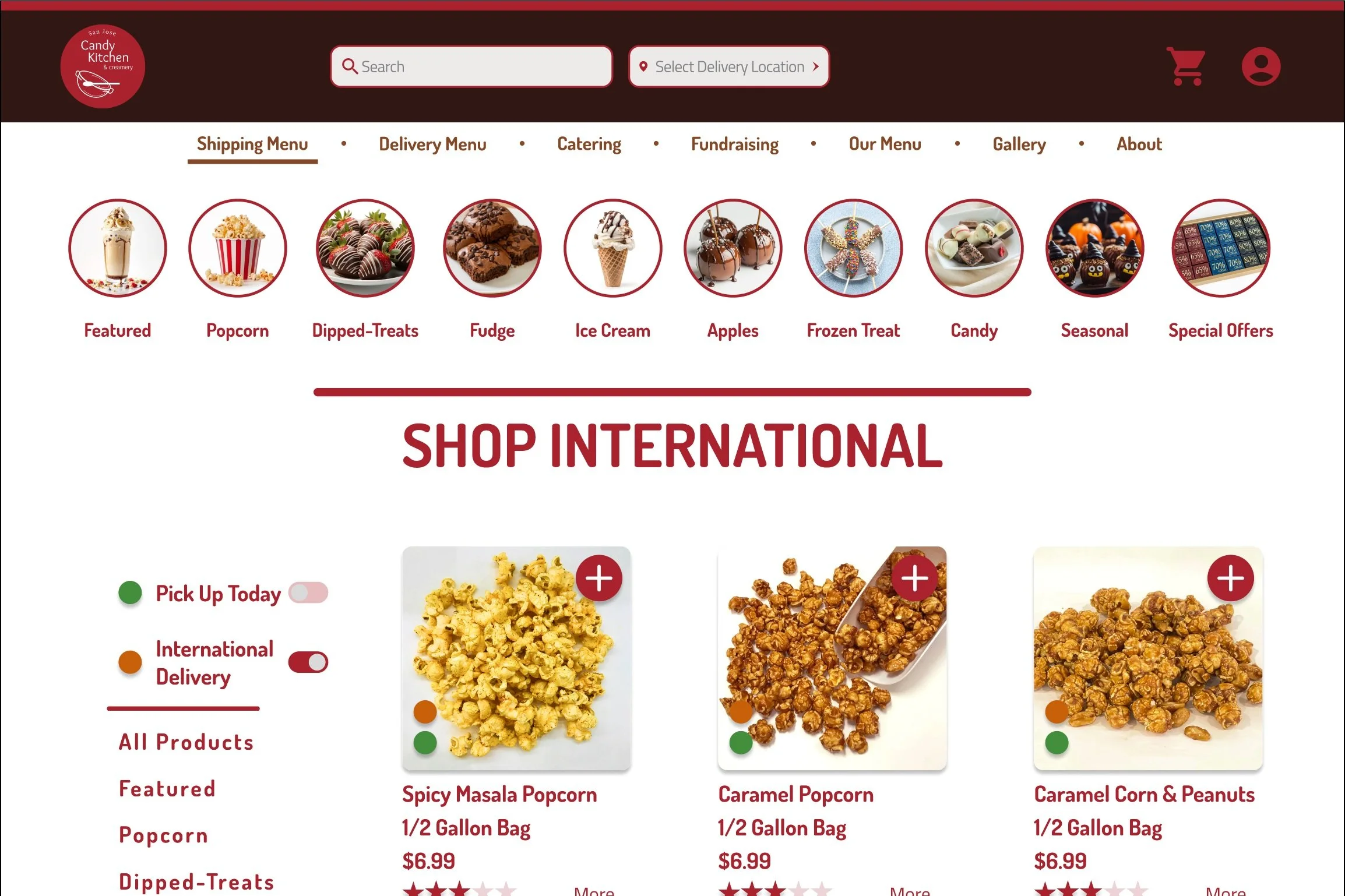
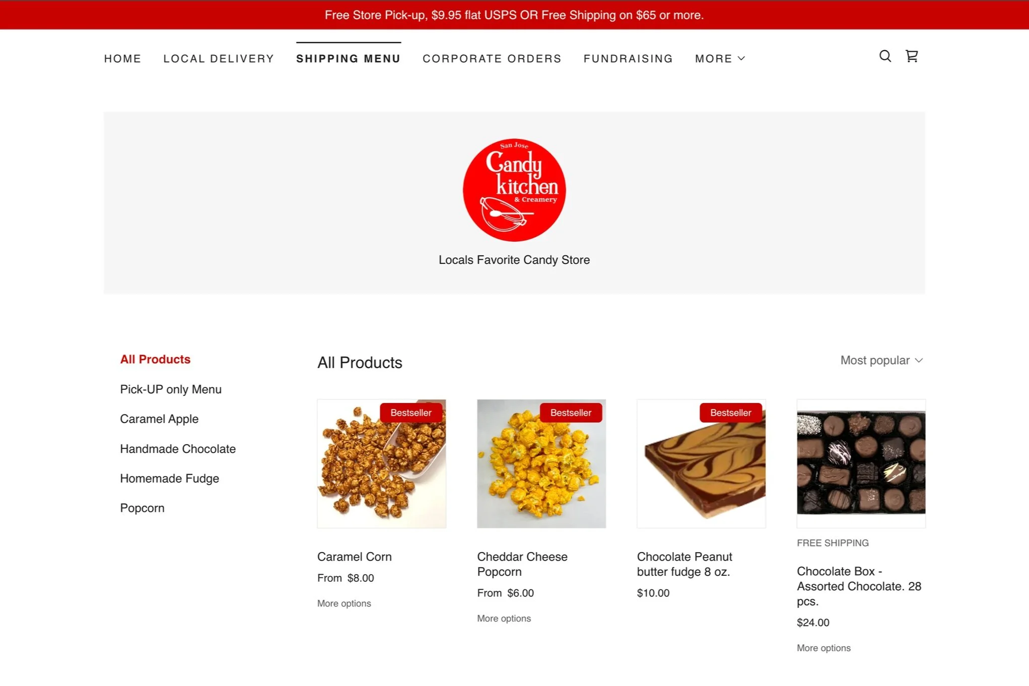
Redesigned Shipping Menu
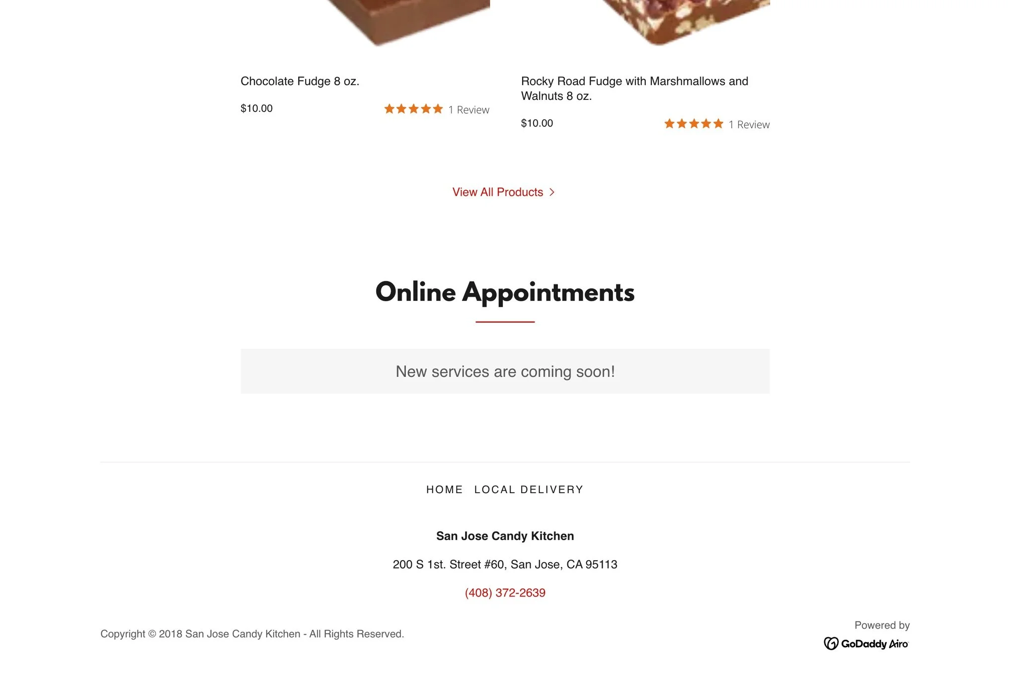
Original Website Footer Menu
Footer Menu

Redesigned Footer Menu
What to expect from the Redesigned Website
Enhanced Color Theme: Updated to align with the brand's identity.New Typography: Improved readability and visual appeal.Visually Appealing Navigation Menu: Redesigned for an attractive look.Intuitive Navigation Menu: Easy to use for a seamless experience.Streamlined Shopping Flow: Simplified process for effortless purchasing.Integrated Chatbot: Added for instant support, quick product guidance, and smoother customer assistance.
Future Enhancements
Allow customers to customize the ingredients in their orders.Provide real-time status updates for international orders.Implement an icon or image search feature for easier product discovery.Develop points and benefits for repeat customers.Launch a special discount on Turtle Tuesdays to encourage sales.
Key Takeaways
This project was a true exercise in teamwork and adaptability. I'm especially proud of how smoothly our team collaborated. We respected each other's roles, welcomed feedback without hesitation, and worked in sync without interfering with one another. Despite a tight timeline and the challenge of completely rebuilding the website, we stayed focused, divided tasks effectively, and made thoughtful design decisions that were always guided by user needs.Through this process, I improved my ability to build and reuse components efficiently, gained confidence using design systems, and learned new ways to organize and streamline design files for clarity and consistency. It reminded me how essential clear communication, trust, and adaptability are in team projects, especially when working under pressure. I also saw how important it is to test early and often since user feedback consistently brought new insights that shaped our direction.Going forward, I’m excited to further sharpen my prototyping skills and strengthen my user research practice by creating more opportunities for meaningful conversations with users early in the design process. I want to better understand the reasons behind their behaviors and needs so I can design more empathetic, inclusive, and intuitive experiences. This project reaffirmed my passion for designing with people rather than just for them, and I look forward to applying these lessons in future projects.Acknowledgement
I would like to extend my heartfelt thanks to everyone who contributed to this project.To my amazing team members, thank you for your collaboration, creativity, and support throughout each stage of the design process. Your insights and teamwork made this experience both productive and rewarding.To stakeholder Ajay Patel, thank you for your valuable input, direction, and thoughtful feedback, which were crucial in shaping the vision and success of this project.To all the users who participated in interviews, surveys, and testing sessions, thank you for generously sharing your time and perspectives. Your input was invaluable in creating user-centered solutions and driving meaningful design decisions.This project would not have been possible without each of you.Done Scrolling? Not Yet 😉
Take a peek at more of my design adventures below.


