
California DMV Website Redesign
Improving accessibility and navigation for a high-traffic government website
Role - UX Designer
July 2024 - 5 weeks duration
Team size - Solo Project
Platform - Responsive website
Tools - Figma, Google Forms
Problem -
Users found the DMV website overwhelming and difficult to navigate due to cluttered menus, unclear labels, and inconsistent information hierarchy.
Outcome -
Simplified navigation to reduce cognitive load
Improved accessibility and clarity of key services
Reduced the number of steps required to complete common tasks
The California DMV website supports critical services for millions of residents, but the current experience can feel overwhelming, especially for first-time visitors trying to complete time-sensitive tasks.
In this project, I redesigned key flows to improve navigation, readability and usability across devices. I led the full design process from research and wireframes to high-fidelity UI and prototyping, focusing on making essential actions faster and easier to complete.
ROLES & RESPONSIBILITIES
Researched UI issues on existing DMV sites.
Designed a modern, clean interface in Figma.
Focused on mobile-first and responsive layouts.
Simplified navigation with clear icons and structure.
Applied accessibility best practices (WCAG).
Created reusable UI components for consistency.
Built high-fidelity mockups and interactive prototypes.
Handled all design phases independently.
THE PROBLEM
Users struggle to navigate the DMV website due to repetitive links, cluttered menus, and disorganized information architecture, making it difficult to find specific information and complete tasks efficiently.
FINAL RESULTS
If you’re short on time, here’s a quick glimpse of the key changes from our redesign. Below are before-and-after screenshots highlighting the transformation. You can also click here to jump straight to the final solutions and results.
Before

After
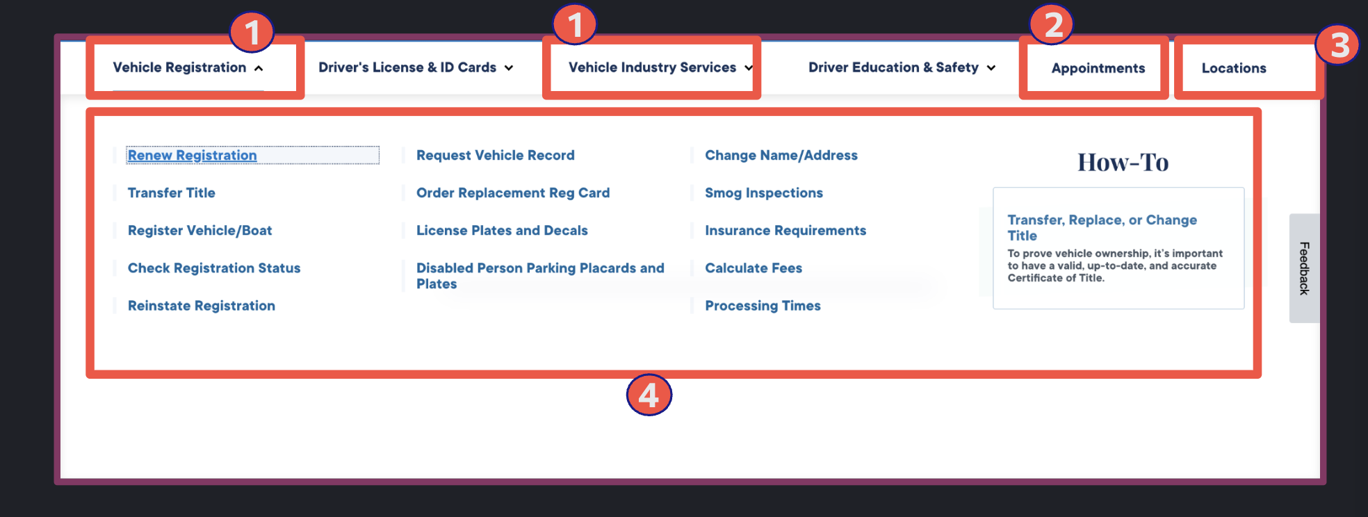
ANNOTATIONS


Usability heuristics issues
Some specific jargon confuses users.
The drop-down menu with number of links overwhelm users
Two logos creates confusion about whether they are images or buttons.
The drop-down menus lack organization and are unordered.
The user scrolled up and down the homepage without realizing there was a "Locations" tab for finding nearby DMV offices.
Accessibility
Light font colors on a white background may pose issues for colorblind users.
User Errors
Accidental click on Ca.gov logo can take user out of DMV website
Pain Points
Some icons are only understandable and some are very small.
INFORMATION ARCHITECTURE

Why Redesign Header?
Remove Subcategories: Eliminate About, Customer Service, and Research & Reports to reduce clutter and streamline navigation.
Remove Redundant Links: Eliminate redundant links such as Online Services and Privacy to avoid repetition and enhance clarity.
Add ca.gov Logo: Include the ca.gov logo next to the copyright statement to reinforce government affiliation and trust.
Rename Privacy Policy: Change "Privacy Policy Statement" to simply "Privacy Policy" for clarity and directness.
Maintain Essential Links: Keep Conditions of Use, Sitemap, Accessibility , Virtual Field Office, Forms, News & Media, and Careers links unchanged for easy access to critical information.
Revamp Social Media Icons: Update social media icons with more visually appealing designs that align with modern aesthetics.
Why Redesign Main & Sub Navigation?
Merging Vehicle Industry Services into Vehicle Services: Putting all vehicle-related services under "Vehicle Services" makes it easier for users to find and understand their options.
Centralizing Appointment Options: Removing appointment options from the primary menu and integrating them into relevant service pages streamlines access, reduces clutter, and ensures users can easily find scheduling options directly on the relevant pages.
Relocating Location Search to the Homepage: Moving location services to the homepage and relevant service pages will enables direct access for users searching for DMV offices and nearby services.
Implementing Tertiary Menu with Categorized Submenus: Introducing a tertiary menu and categorizing submenus enhances organization, making it easier for users to find specific services efficiently.
Adding "New to California" Tab: Including a dedicated tab for newcomers to California provides direct access to essential information and services tailored to their needs.
Introducing "Accessibility Portal" Tab: Introducing an "Accessibility Portal" tab provides a dedicated space where people with disabilities can easily access all relevant services. This tab ensures that critical information and links, which might be easily overlooked in standard service notes, are prominently featured for enhanced accessibility and usability.

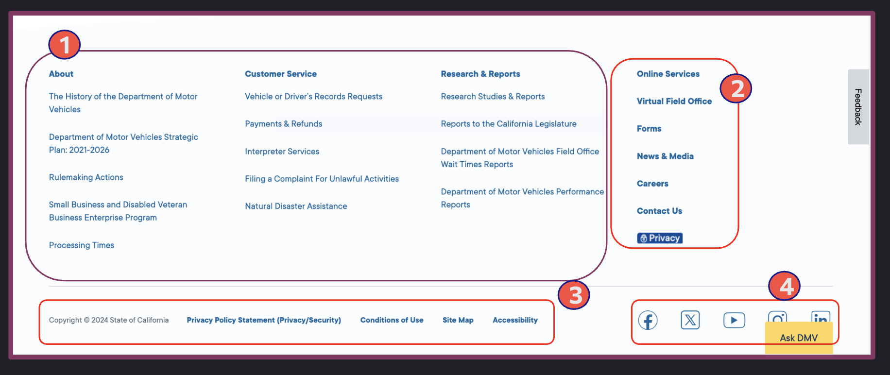
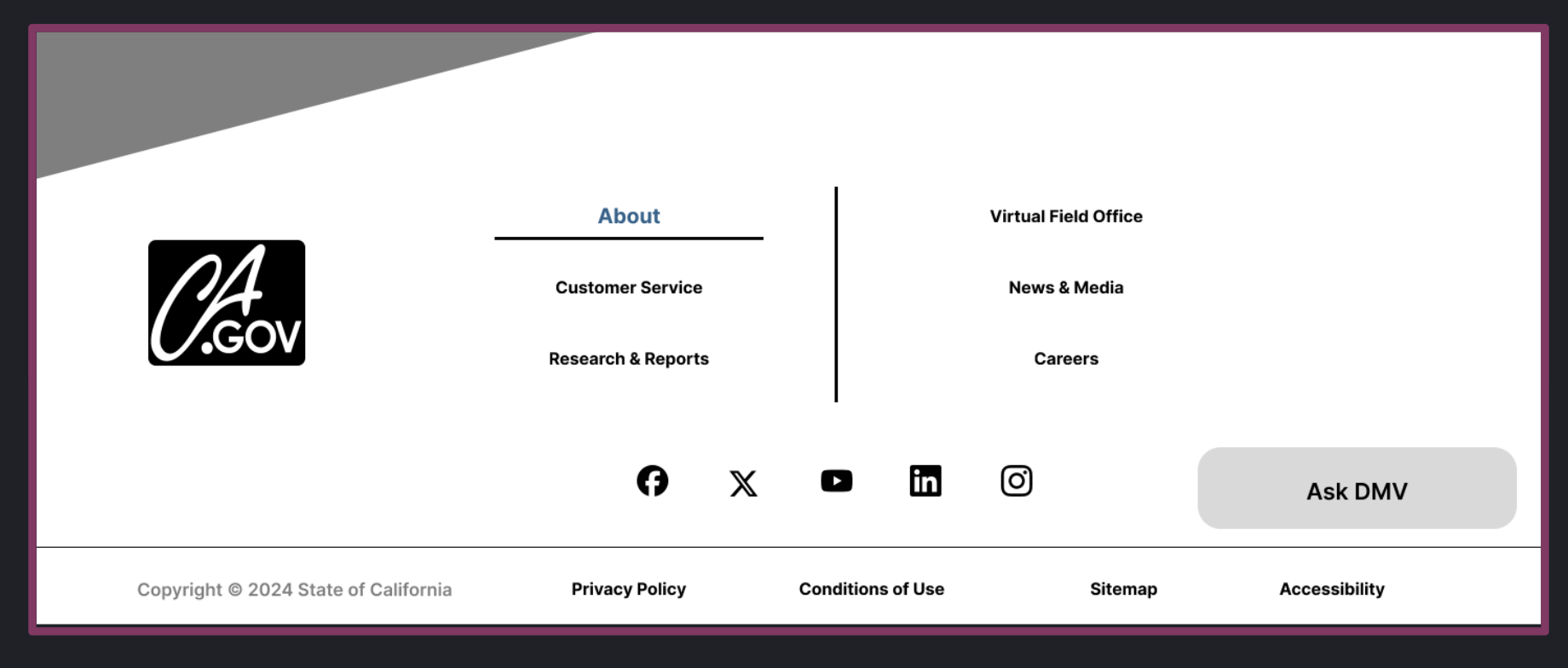
Why Redesign Footer?
Remove Subcategories: Eliminate About, Customer Service, and Research & Reports to reduce clutter and streamline navigation.
Remove Redundant Links: Eliminate redundant links such as Online Services and Privacy to avoid repetition and enhance clarity.
Add ca.gov Logo: Include the ca.gov logo next to the copyright statement to reinforce government affiliation and trust.
Rename Privacy Policy: Change "Privacy Policy Statement" to simply "Privacy Policy" for clarity and directness.
Maintain Essential Links: Keep Conditions of Use, Sitemap, Accessibility , Virtual Field Office, Forms, News & Media, and Careers links unchanged for easy access to critical information.
Revamp Social Media Icons: Update social media icons with more visually appealing designs that align with modern aesthetics.
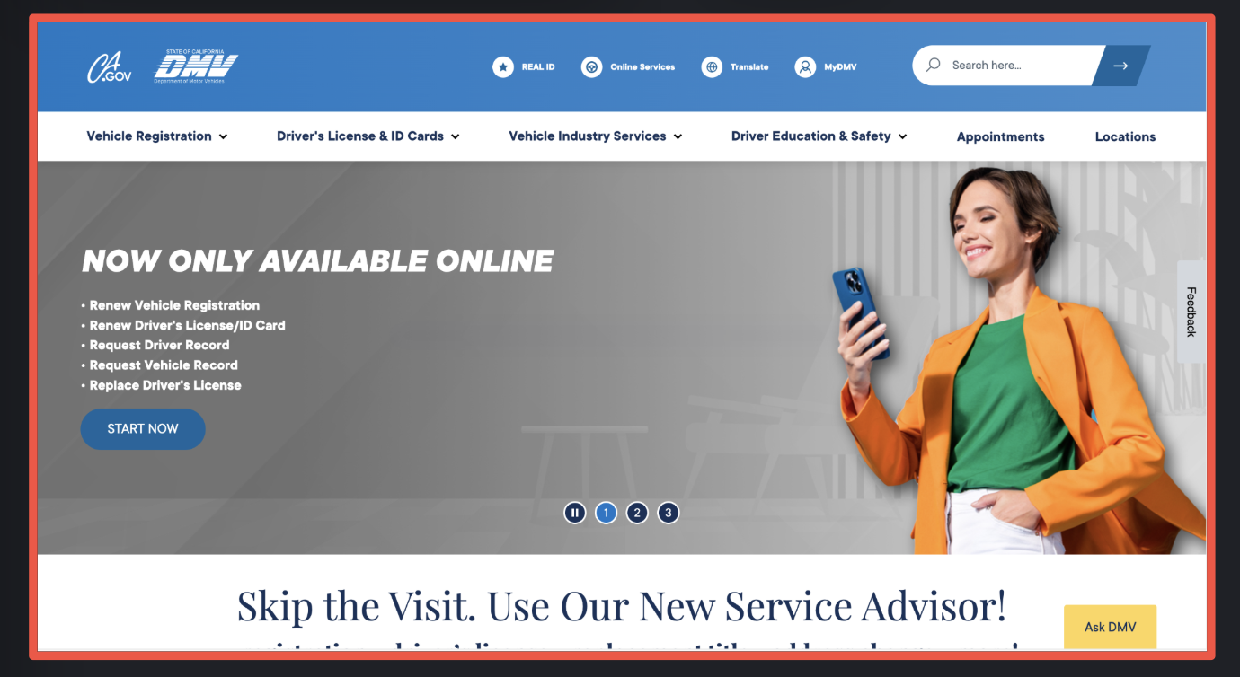
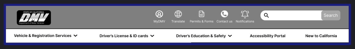
HOME PAGE UI DESIGN
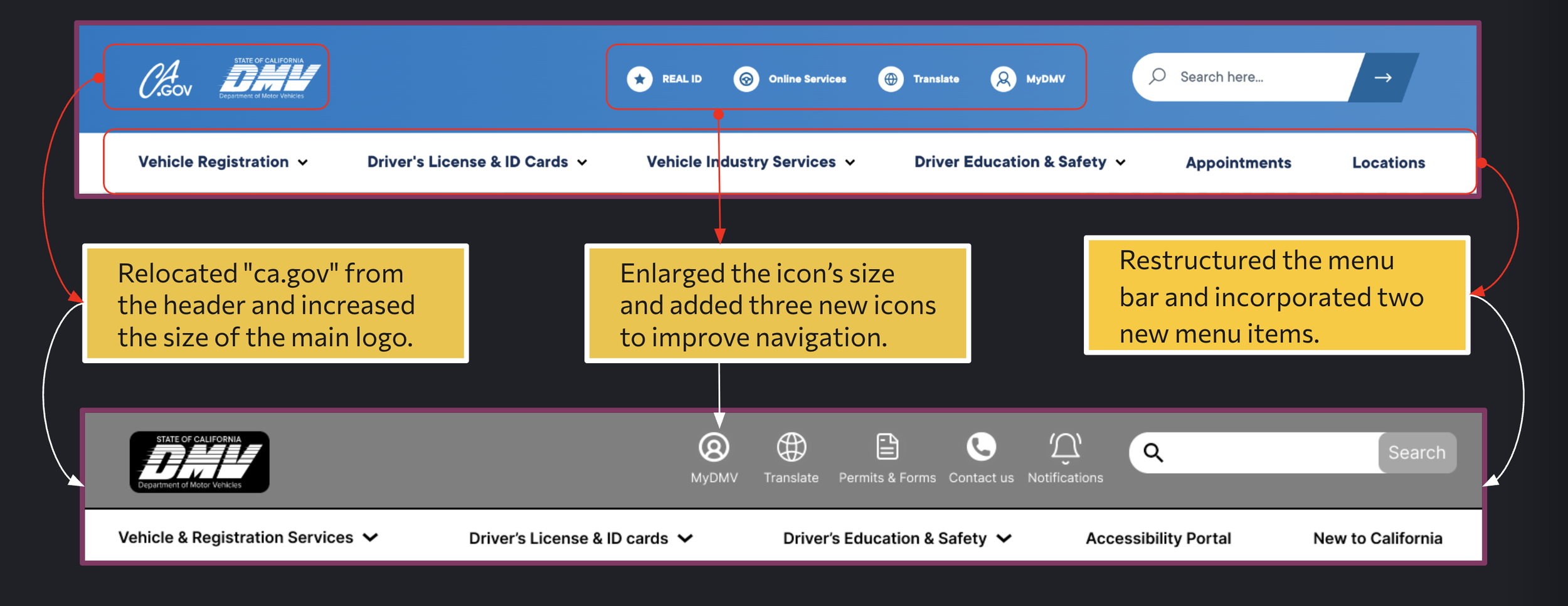
Header Redesign
This image showcases updates to the DMV website header: the "ca.gov" label was repositioned, the main logo enlarged, and new icons were added for easier navigation. The menu bar was also restructured with two additional items for improved organization.
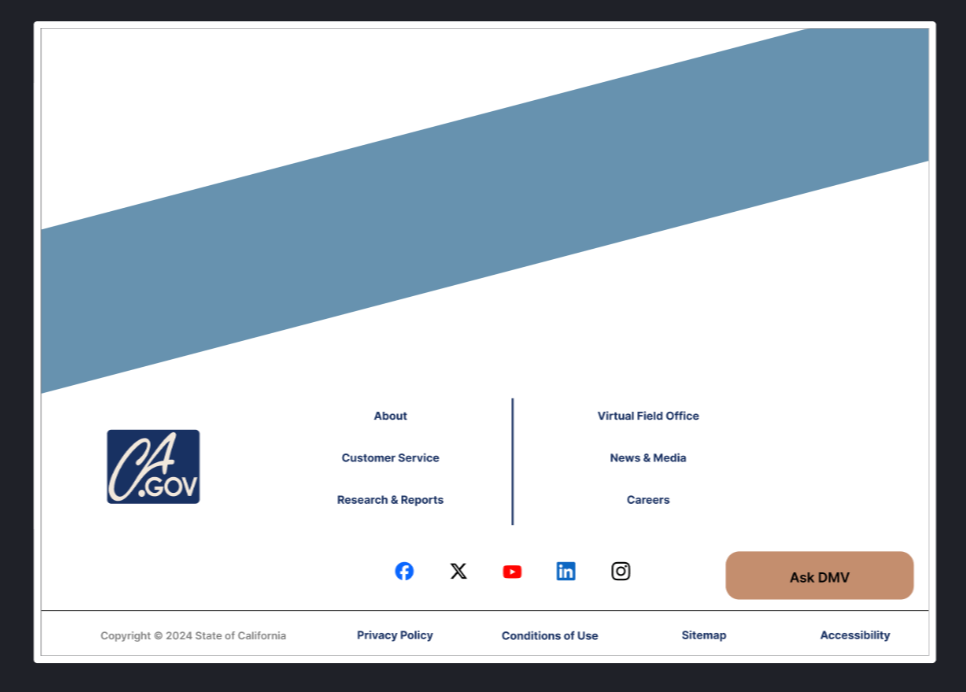
Footer Redesign
Original
Redesigned
Eliminated all excess submenus and added them to the main footer category, along with adding the ca.gov logo to the footer.
Shortened the side menu and moved the important items (like Forms & Contact Us) to the header.
Maintained the same elements and spaced out the remaining footer navigation.
Altered the placement and style of the social media icons.
Original
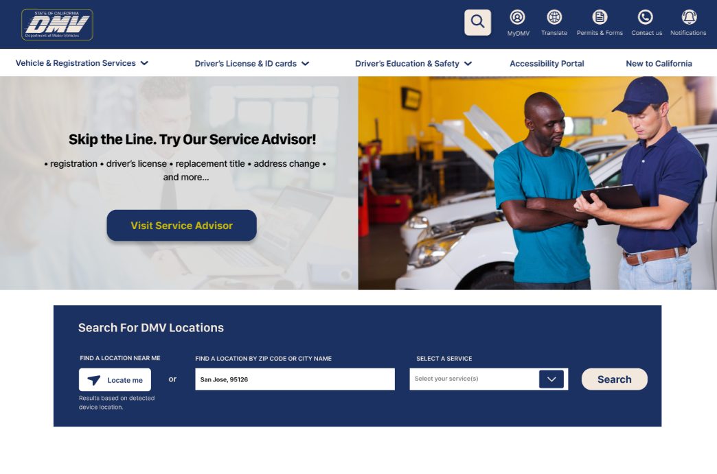
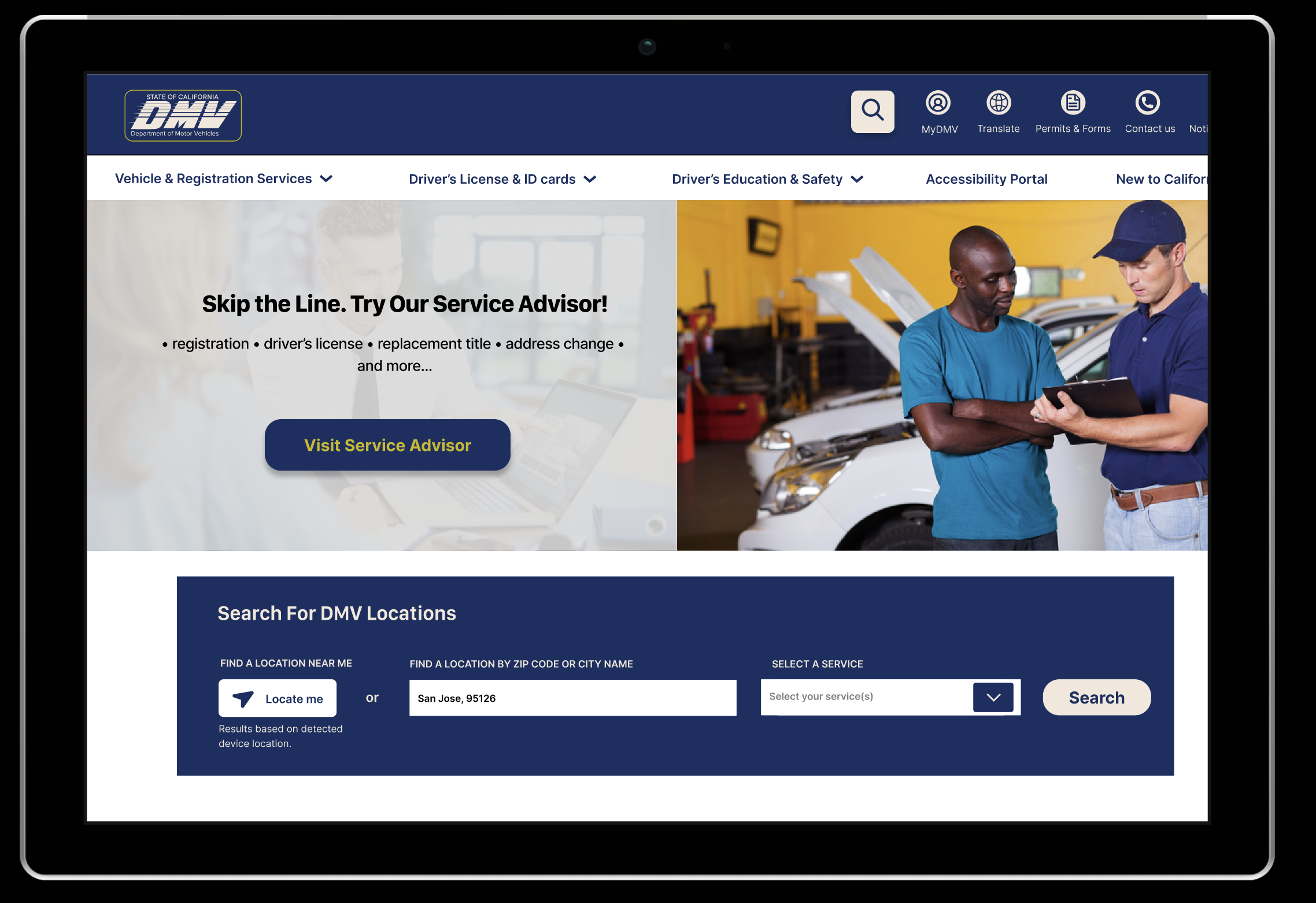
Desktop Homepage Redesign
Redesigned
Using UI pattern guides and a UI grid, I redesigned the layout. I replaced the original banner pictures with a single card featuring a new DMV website feature. I relocated the location tab from the menu bar to the homepage for quicker navigation, reducing the user path from 7 steps to 6 and 5 webpages to 3.
Original User Path
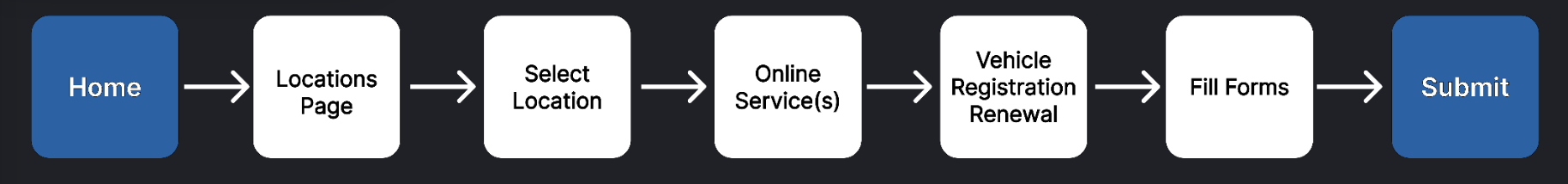
After Redesign

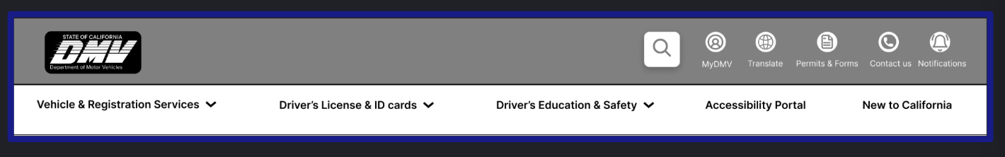
5 Seconds Usability Test
✓ - Considering ✗ - Not Considering
Users Feedback
✓ The logo should be smaller.
✓ The search bar is too large.
✓ The placement of the global icon draws attention because it's positioned closer to the center rather than towards the right.
✗ The hamburger menu should be positioned on the left side for mobile responsiveness.
In response to usability test feedback and implemented changes, I introduced an interactive search bar in the header, reduced the size of the global menu, and scaled down the logo.
Before
After
UI Inspiration & Style Tile
Inspiration

Style Tile
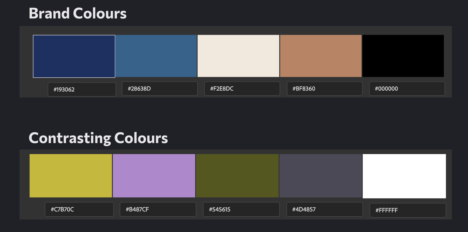
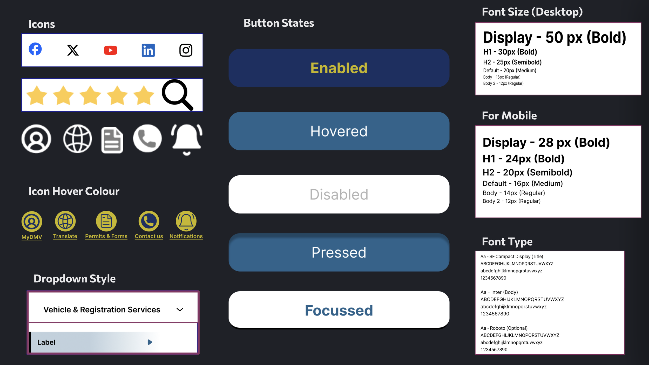
After conducting accessibility tests and using a contrast checker, I have established the primary and secondary colors for the website and its theme.

Primary Interaction Color
Secondary Interaction Color
Third Interaction Color
Design & Testing

Redesigned Desktop & Mobile Homepage
Usability Test Feedbacks
✓ - Considering ✗ - Not Considering
For Desktop
✓ The third picture in the banner group appears artificial and doesn't resonate well.
✓ The image on the vehicle registration page looks stretched.
✓ The renew button pop-up needs a hover effect.
✓ The form page looks different from the others; add a header to this page as well.
✓ The font size of the footer menu is too small, and the overall menu appears too simple with excessive white space.
✗ Reorganize the layout by placing the service provider section below the important information, rather than in the side menu.
✗ Change the dark blue color to the other shade of blue and make it the primary color.
For Mobile
✓ Use light-shade lines as separators for the menu bar.
✓ Change the color of the location services dropdown button.
Considering the common style of the footer menu and also increasing the font size to ensure it looks appropriate and cohesive while avoiding excessive white space.
Before
After

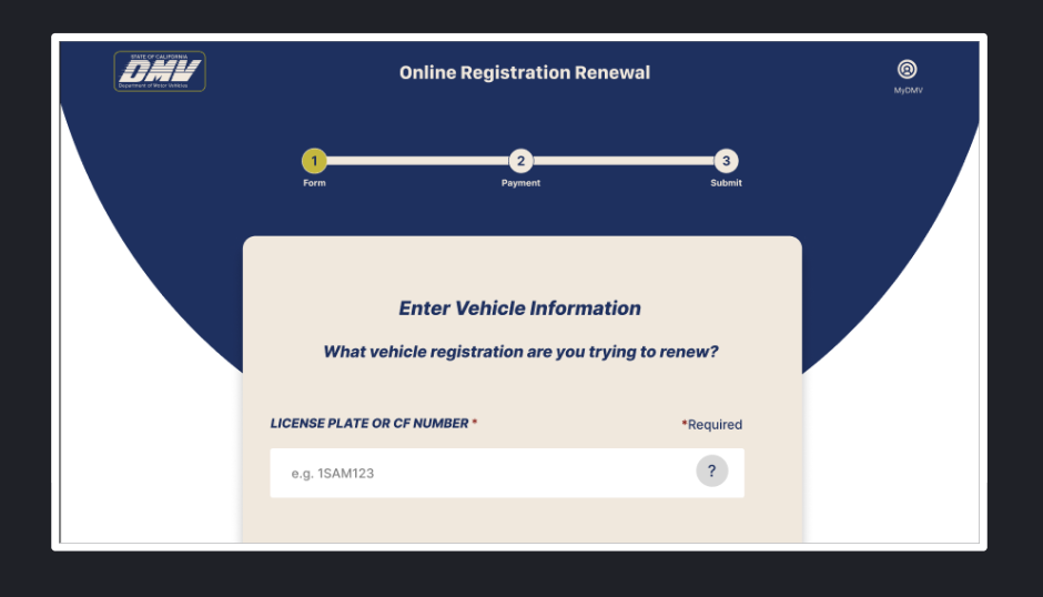
Adding a header to the online registration renewal form page and enhancing accessibility to other menu options while maintaining overall website consistency.
Before

After
Final Thoughts
The DMV website redesign project has been a comprehensive endeavor aimed at enhancing user experience, simplifying navigation, and ensuring accessibility for all users. By implementing a responsive design and interactive features such as the notification bell, a direct "Contact Us" section in the header, accordion dropdowns, a "New to California" menu, and direct location services on the homepage, I have addressed key pain points identified through usability testing.
The focus on both desktop and mobile compatibility and clear iconography has further contributed to a more intuitive interface. Additionally, removing repetitive links that caused confusion has made the site simpler and more straightforward to use. A dedicated menu for individuals with mobility issues ensures that all users can access the services they need with ease.
This redesign not only aligns with modern web standards but also reflects our commitment to providing a seamless, user-friendly online experience for DMV customers. As I progress, ongoing feedback and iterative updates will be crucial for ensuring the website remains effective and continues to meet user satisfaction.
Roadmap
Expanding the DMV website to provide a broader range of online services can reduce the necessity for regular visits to the DMV office.
Implementing automated systems to process and verify documents more efficiently, reducing wait times.
Using VR for interactive tutorials on DMV services.
Providing live video chat options for complex inquiries and document verification.
Implementing custom profiles which can enable users to create and manage personalized profiles that save preferences, history, and frequently used services.
Implementing real-time feedback mechanisms that allow users to submit their opinions on website experience and service quality instantly.
References & Acknowledgement
I would like to extend my heartfelt thanks to everyone who contributed to this project.
To my bootcamp mentors, I am deeply grateful for your guidance, expertise, and encouragement. Your feedback helped me grow as a designer and approach challenges with confidence and curiosity.
To my husband, friends and all the users who participated in interviews, surveys, and testing sessions, thank you for sharing your real-life DMV experiences, challenges, and thoughtful suggestions. Your input was invaluable in shaping a user-centered redesign and driving meaningful design decisions.
This project also drew inspiration from industry-leading resources, including Nielsen Norman Group articles, books such as Design Thinking, Lean UX, and The Design of Everyday Things, and design tools like Figma, Adobe Creative Suite, and Canva, all of which continue to shape my approach to user experience design.
This project would not have been possible without each of you.
Done Scrolling? Not Yet 😉
Take a peek at more of my design adventures below.