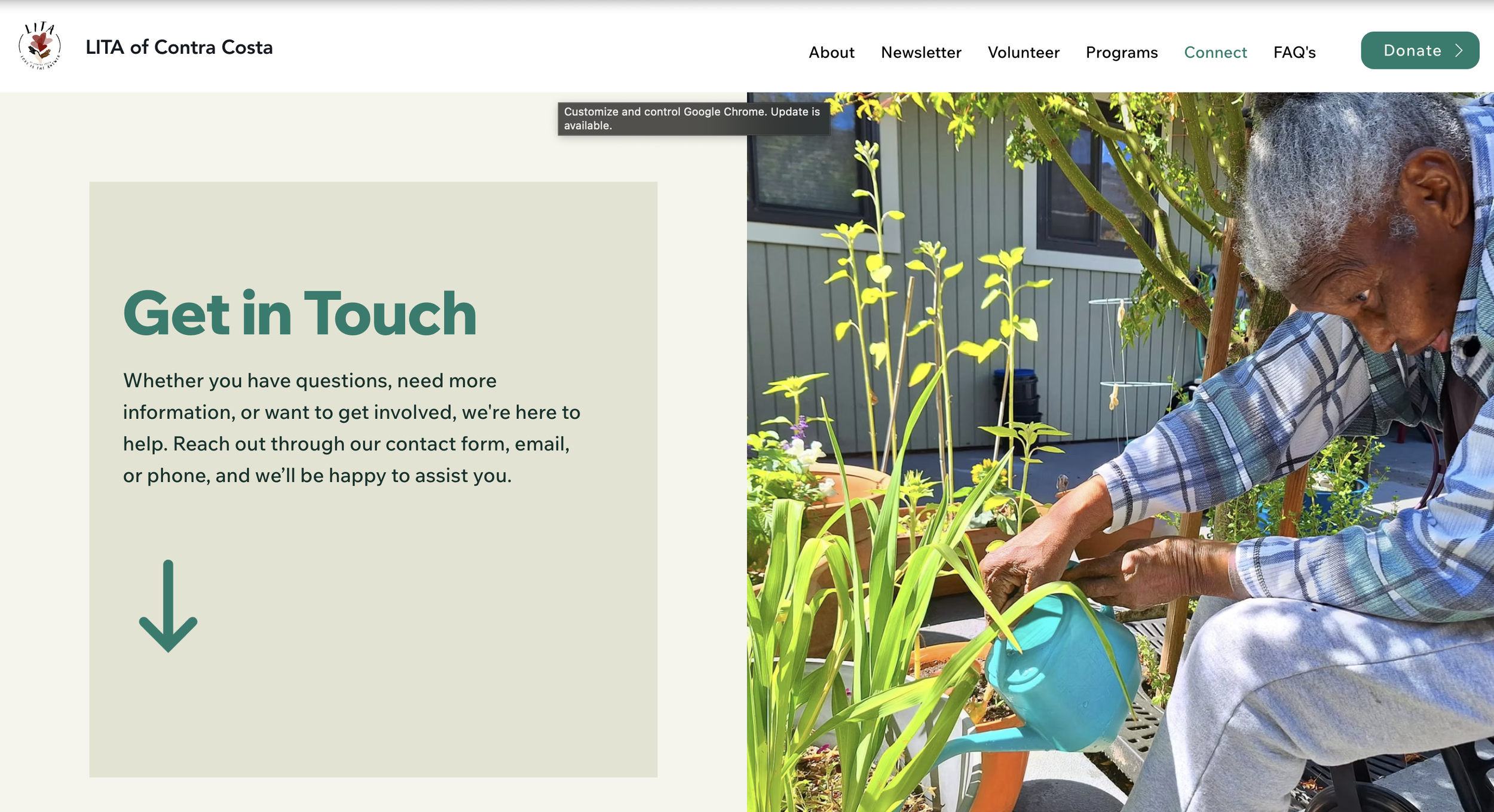
LITA (Love Is The Answer) of Contra Costa
End-to-end redesign improving navigation, trust and user flow efficiency
Project Summary
Project Type:
Responsive nonprofit website redesignMy Role:
UX/Visual Designer3 weeksTimeline:
Team size:
Myself and 3 others Figma, FigJam, Google Suite, Adobe Creative Cloud, Miro, Trello, CanvaTools:
Prototyping, wire-framing, user flows, low to hi-fi mockups, component creation, information architecture, interaction design, visual design, storyboards, stakeholder and user interviews, usability testing, card sorting and 5-second testingDeliverables:
LITA is a nonprofit dedicated to reducing senior solitude through volunteer companionship, supportive programs and meaningful community connection. While the organization’s mission is impactful, the existing website experience made it harder for users to understand the organization quickly and complete key actions.
This redesign focused on improving usability and trust, while making volunteering and donating easier to discover and complete.
The Goal
Redesign LITA’s website to create a clear, accessible and responsive experience that helps users quickly understand the mission and confidently take action, especially volunteering and donating.The Problem
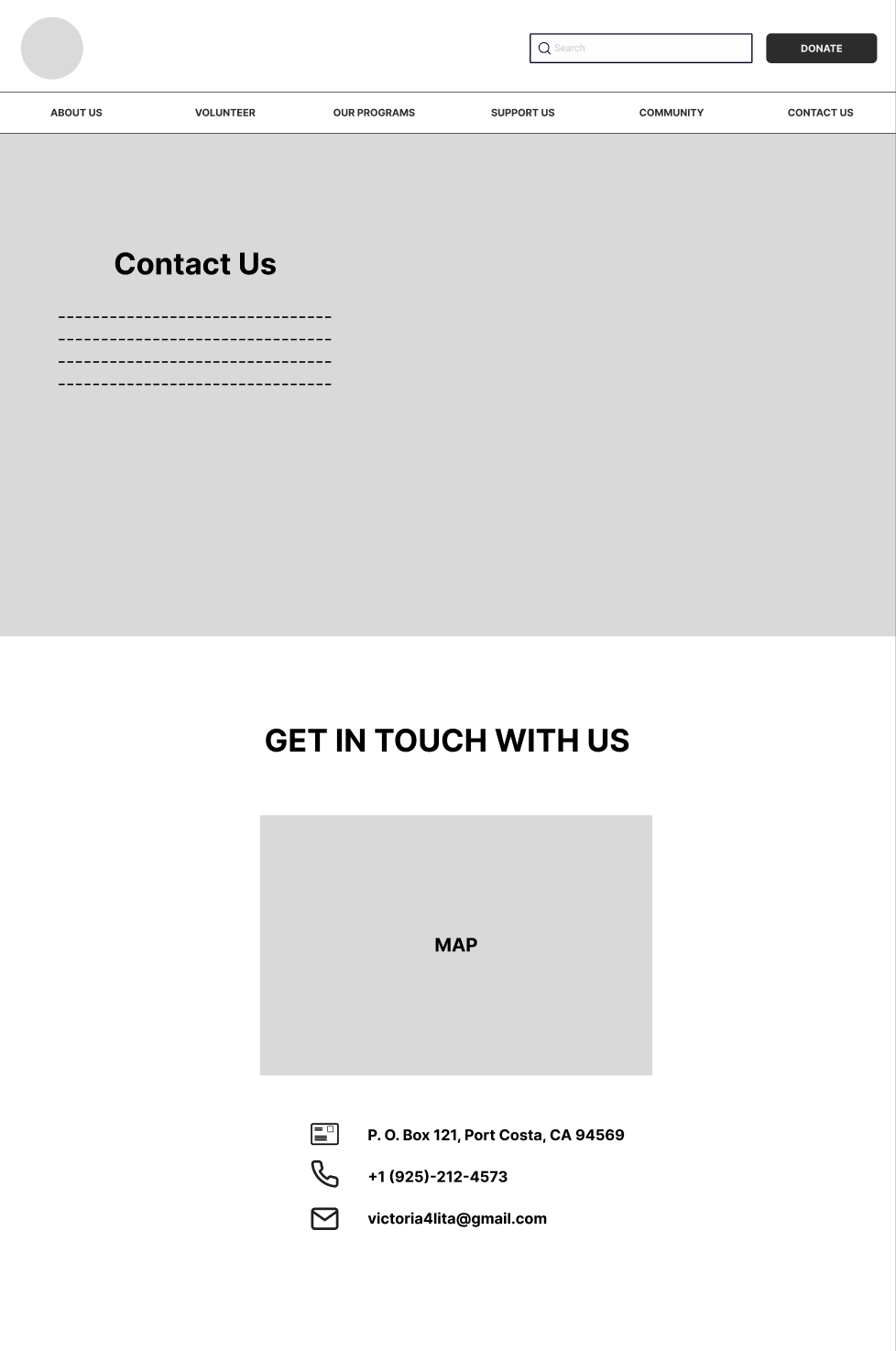
The original website contained important information, but users struggled with:Unclear messaging that didn’t communicate LITA’s mission quicklyNavigation overload, making it hard to find key pagesFriction in volunteer and donation paths, reducing conversionsMobile and readability issues, causing scanning difficulty and confusion
This created friction for users who wanted to help but couldn’t easily complete key actions.
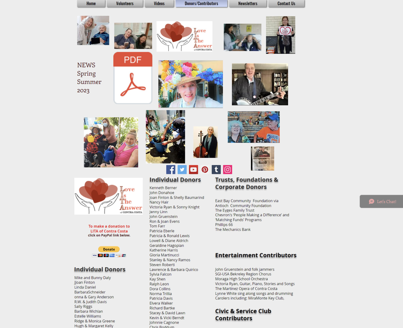
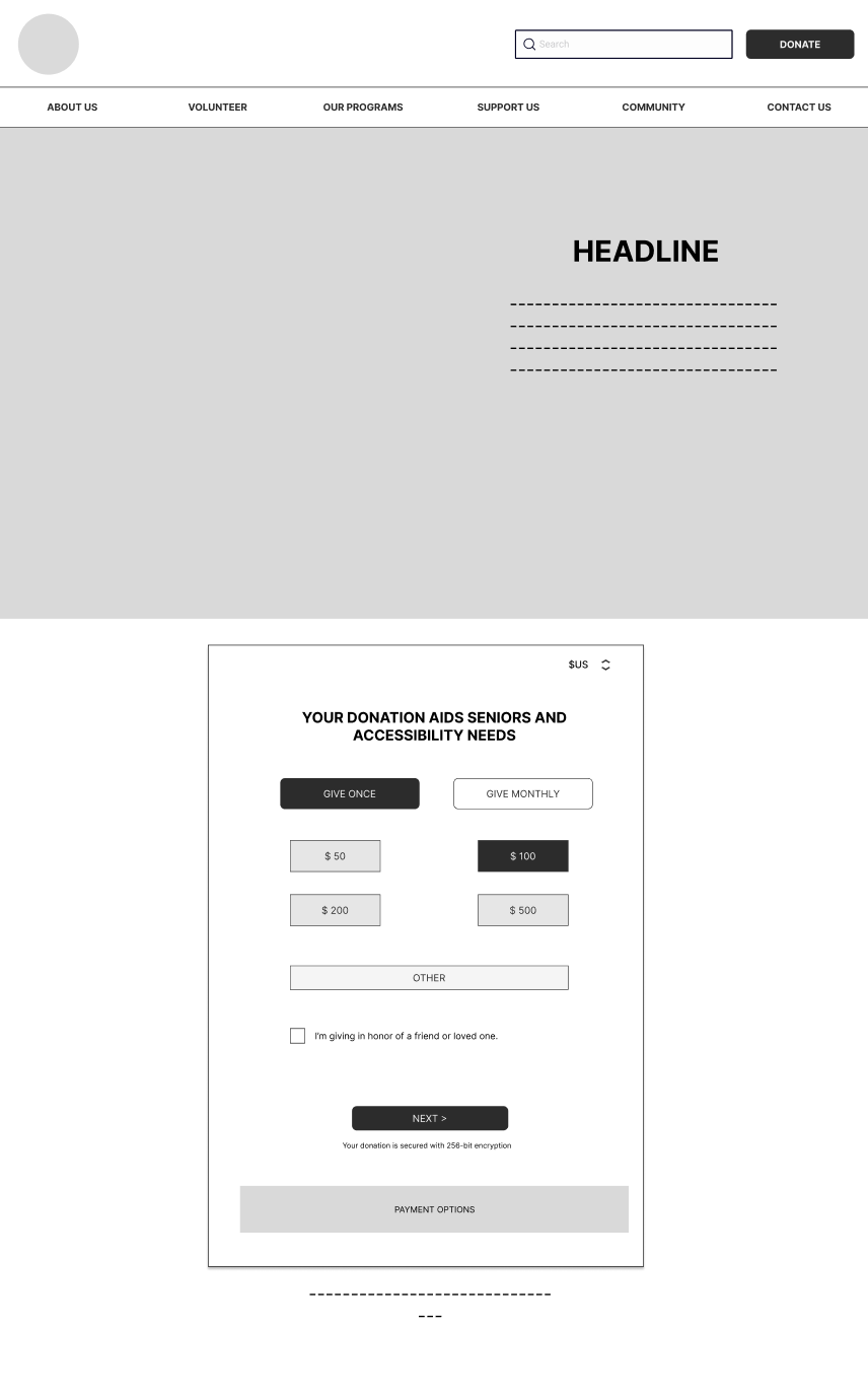
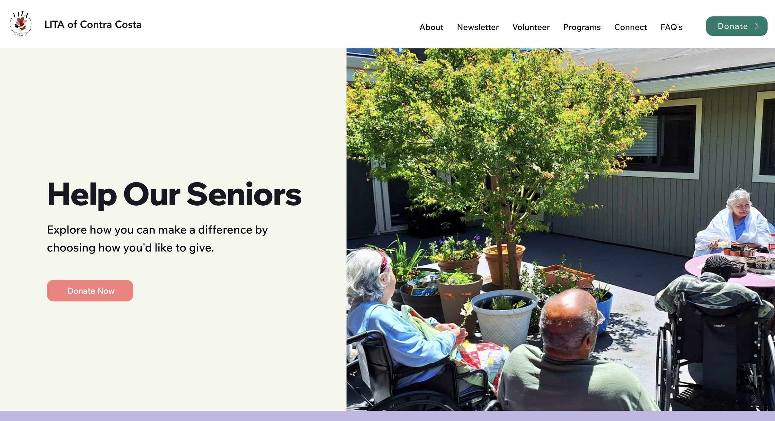
Donation Page Before Redesign
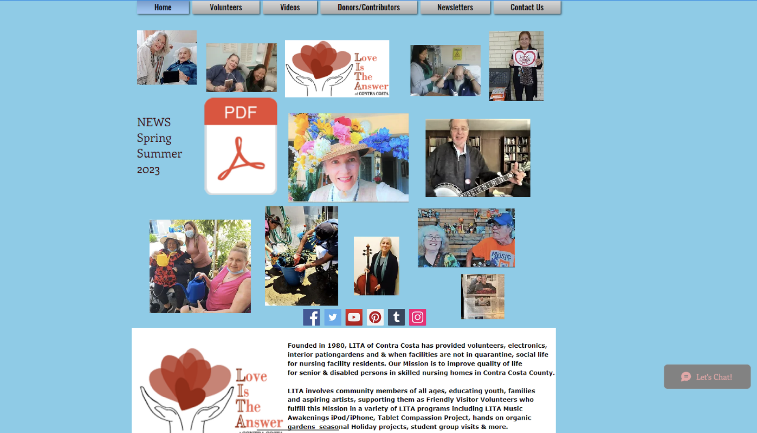

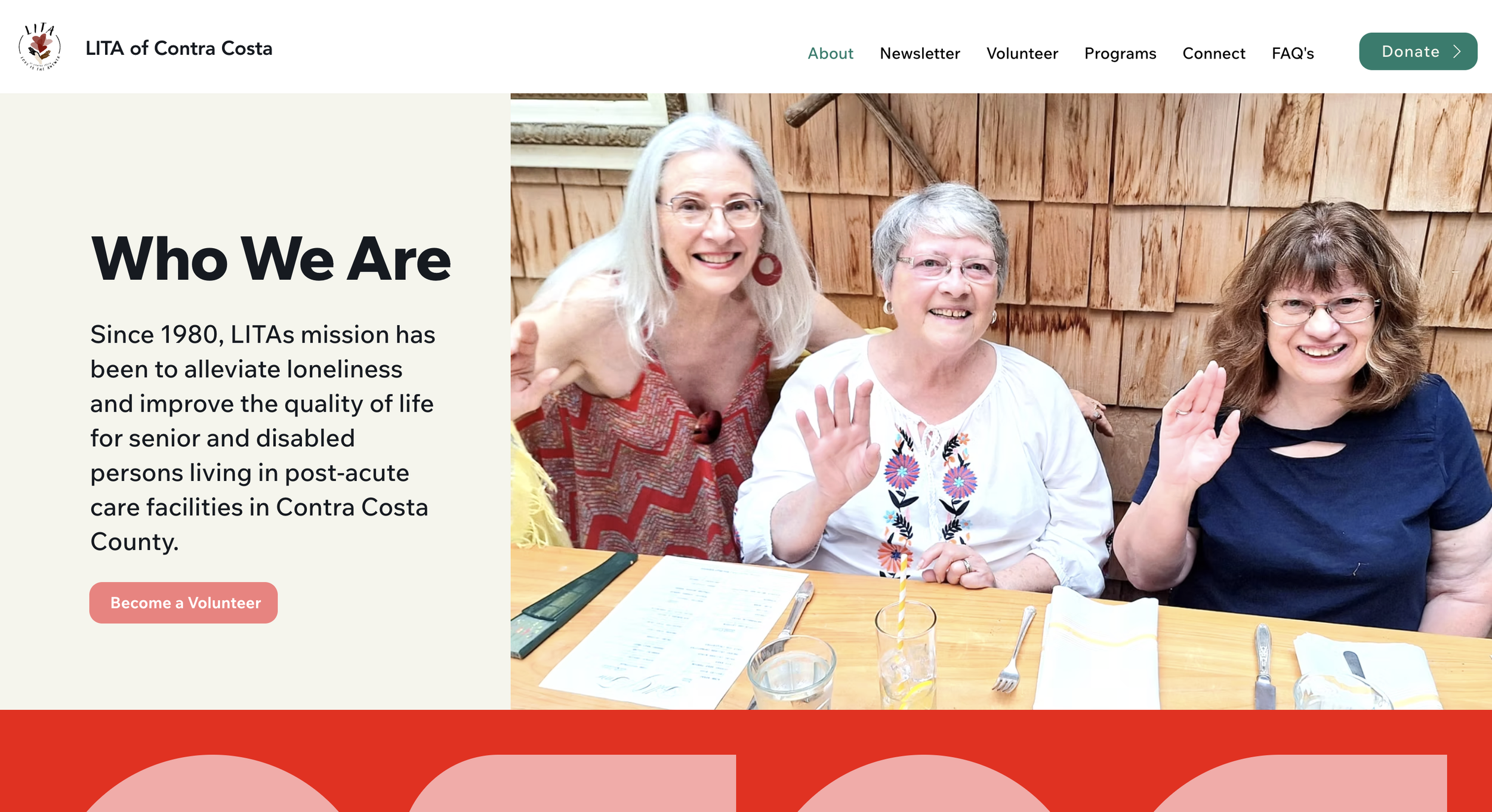
Homepage Before Redesign
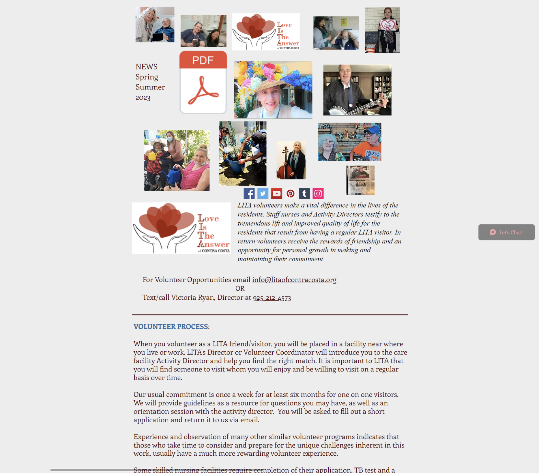
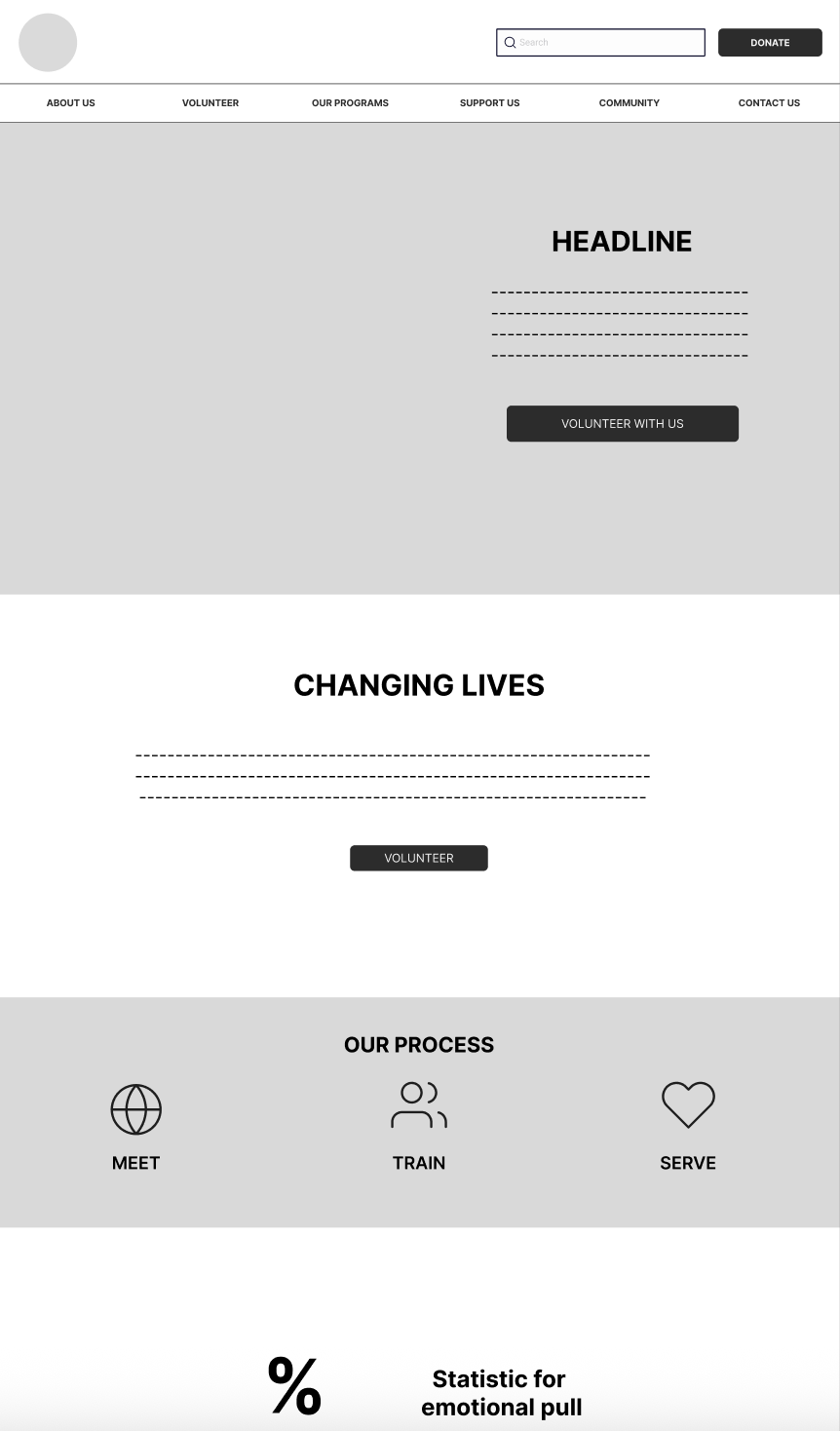
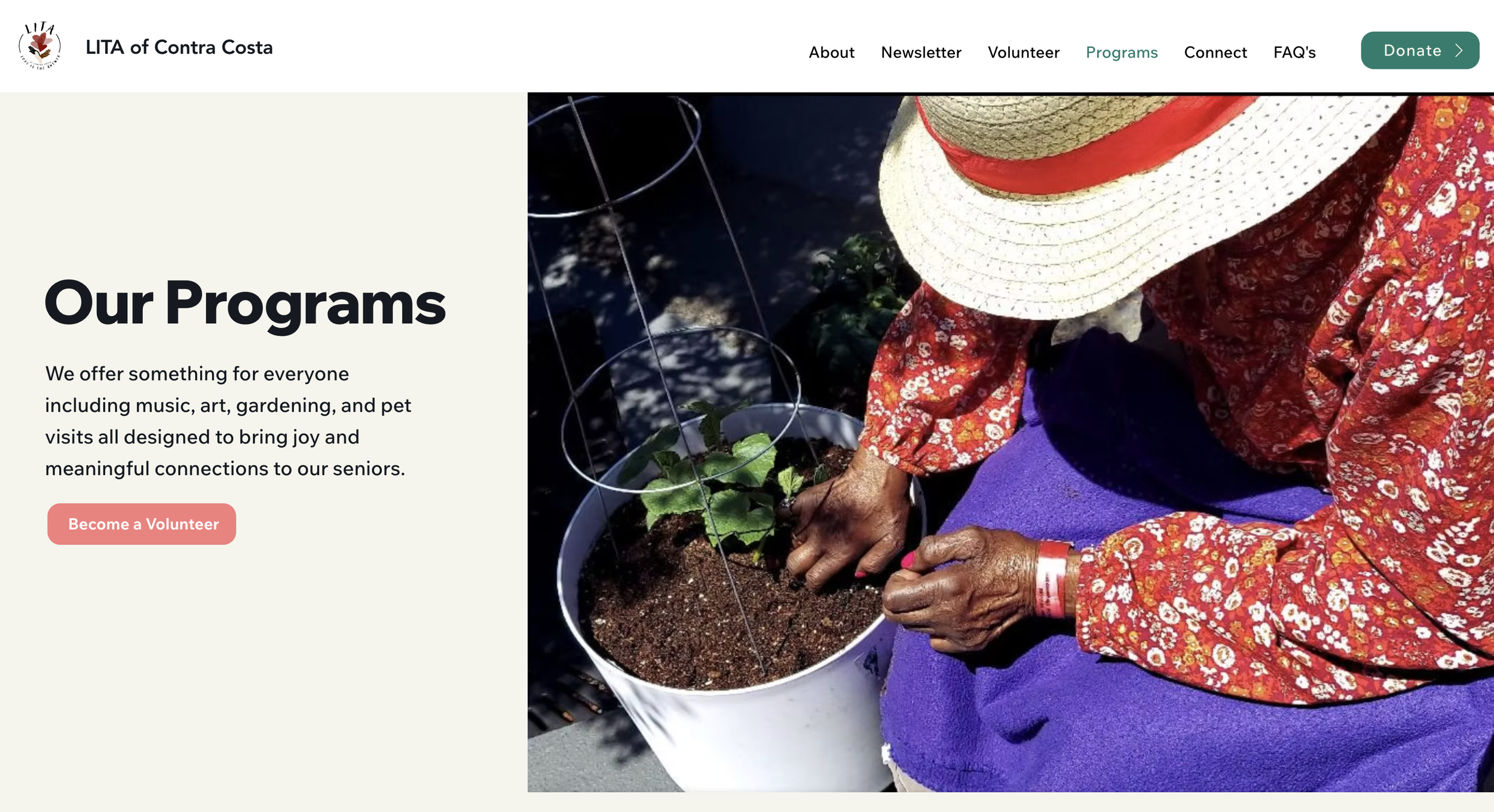
Volunteer Page Before Redesign
What Success Looked Like
To define success, we aligned the redesign around 4 measurable outcomes:Users can understand LITA’s mission within secondsVolunteer opportunities are easy to locate and exploreDonation actions feel trustworthy and straightforwardThe site works smoothly across screen sizes with accessible readability
Research Discovery
To understand user pain points and opportunities, we conducted:Usability testing on the existing siteCompetitive analysis of nonprofit and donation-driven websitesInsight synthesis using affinity mapping and pattern groupin
Key Insights
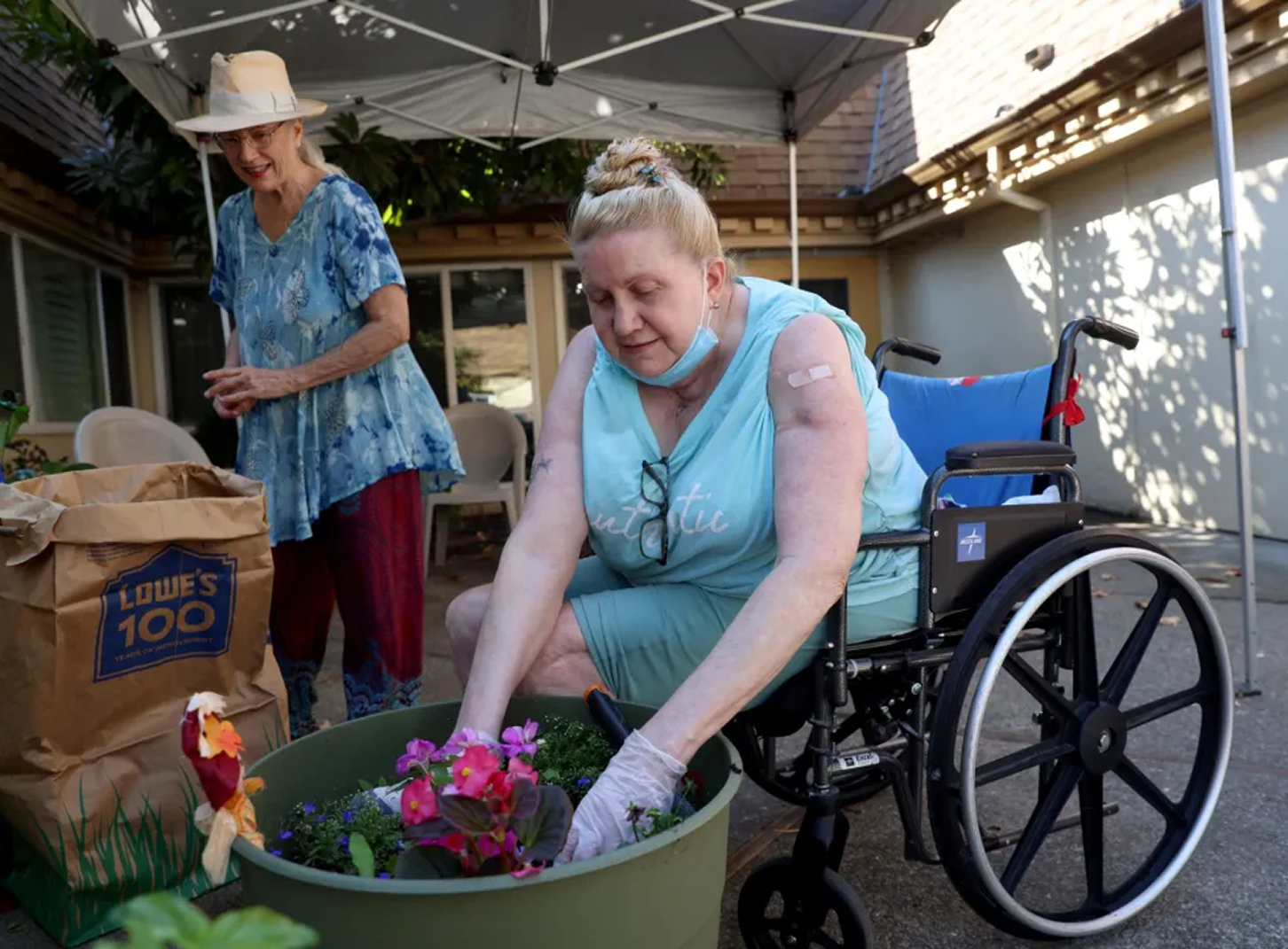
Users needed:A clearer explanation of what LITA does and who it supportsFewer competing links and more guidance through the siteStronger donation confidence through trust and clarityA simpler way to explore volunteering without feeling overwhelmedExcessive & distracting scattered pictures
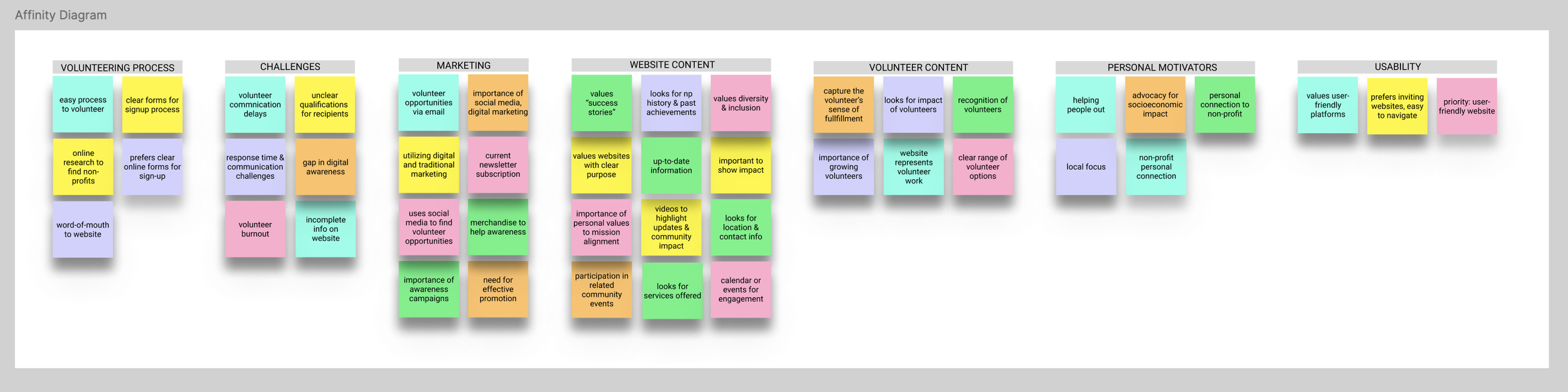
Themes from research revealed key blockers: unclear information hierarchy, weak donation trust signals and volunteer flow friction.
Design Strategy
We focused on designing a responsive experience that improved clarity, trust and action-taking through:Stronger information hierarchy and section structureSimplified navigation and more predictable page groupingClear CTAs for Volunteer and Donate throughout the experienceAccessible layout decisions (spacing, contrast, readability)Reduced cognitive load by breaking content into scannable sections
Information Architecture Improvements
The original navigation contained too many competing options and unclear grouping. We reorganized the structure so users could quickly find the most important actions and information.Updated Navigation Priorities
HomeAboutNewsletterVolunteerDonatePrograms / ServicesContact
This helped reduce confusion and supported the two most important user journeys: volunteering and donating.
Mid-Fidelity Wireframes
To translate research insights into structure, we created mid-fidelity wireframes to validate layout and hierarchy before visual design.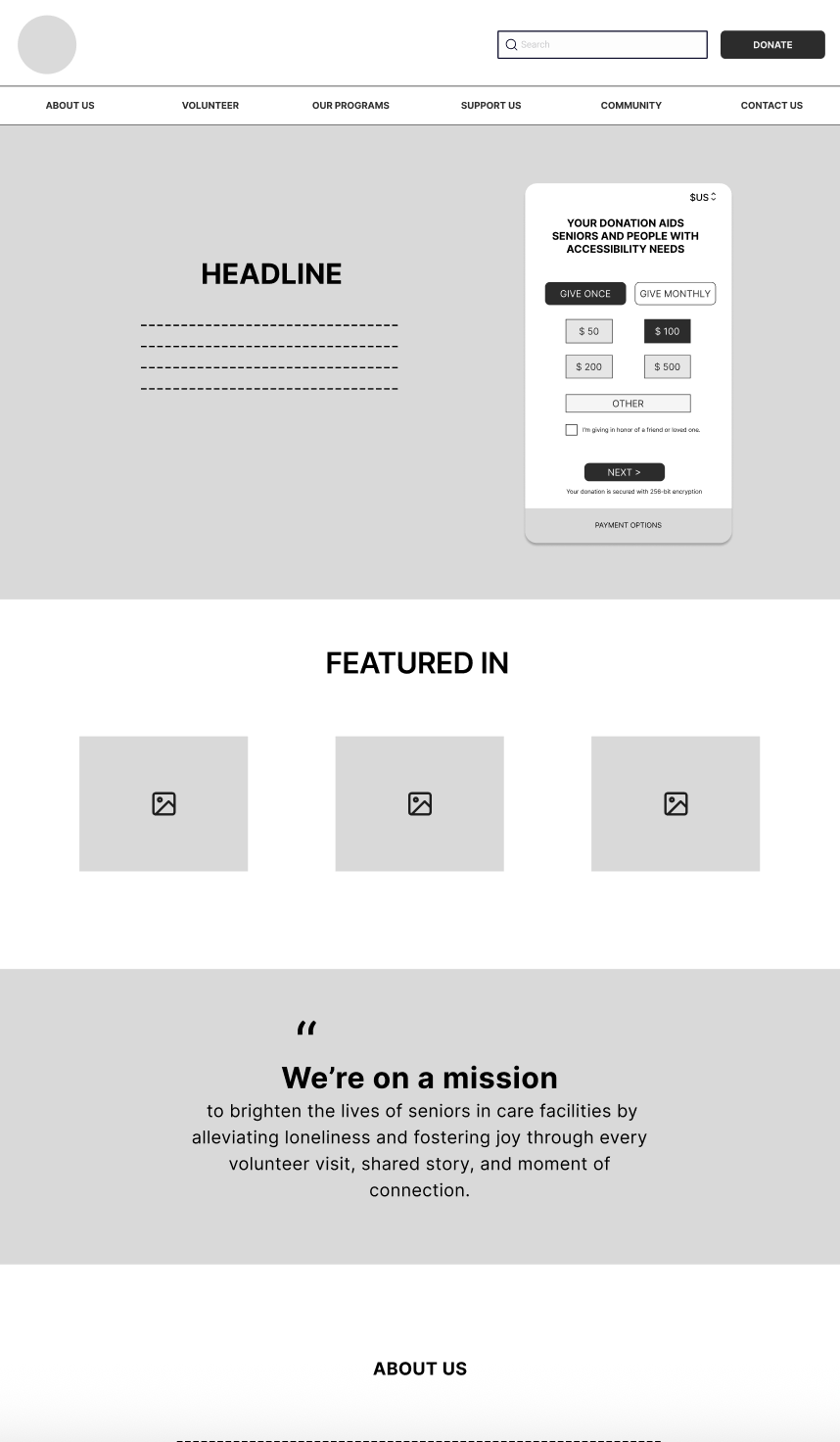
Home Page
Donation Page
Volunteer Page
Contact Page
Mid-fidelity wireframes used to test information hierarchy, content grouping and CTA placement before visual styling.
What We Designed
KEY SOLUTIONS
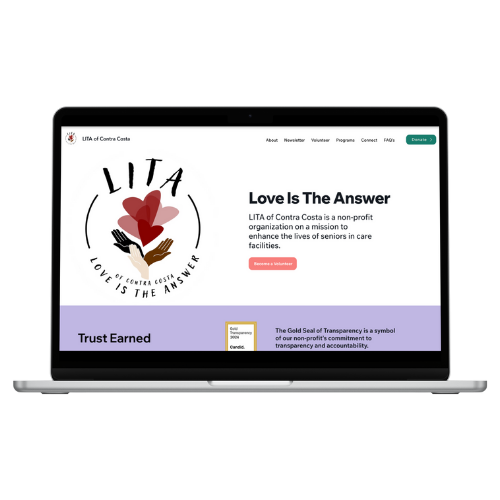
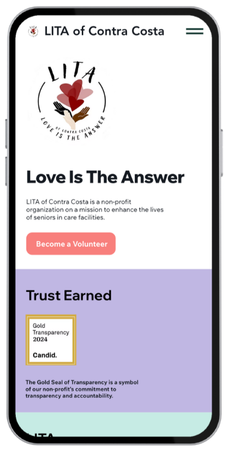
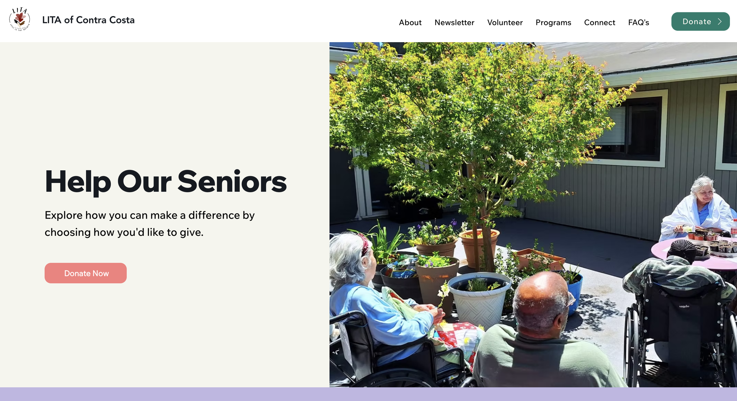
1) Homepage That Explains the Mission Fast
We redesigned the homepage to immediately answer three user questions: “What is LITA? Who does it help? How can we support the mission?”
To support action, we introduced clear primary CTAs: 1. Volunteer 2. Donate We also improved section order so users could scan naturally from mission → services → action.Desktop Homepage

Mobile Homepage
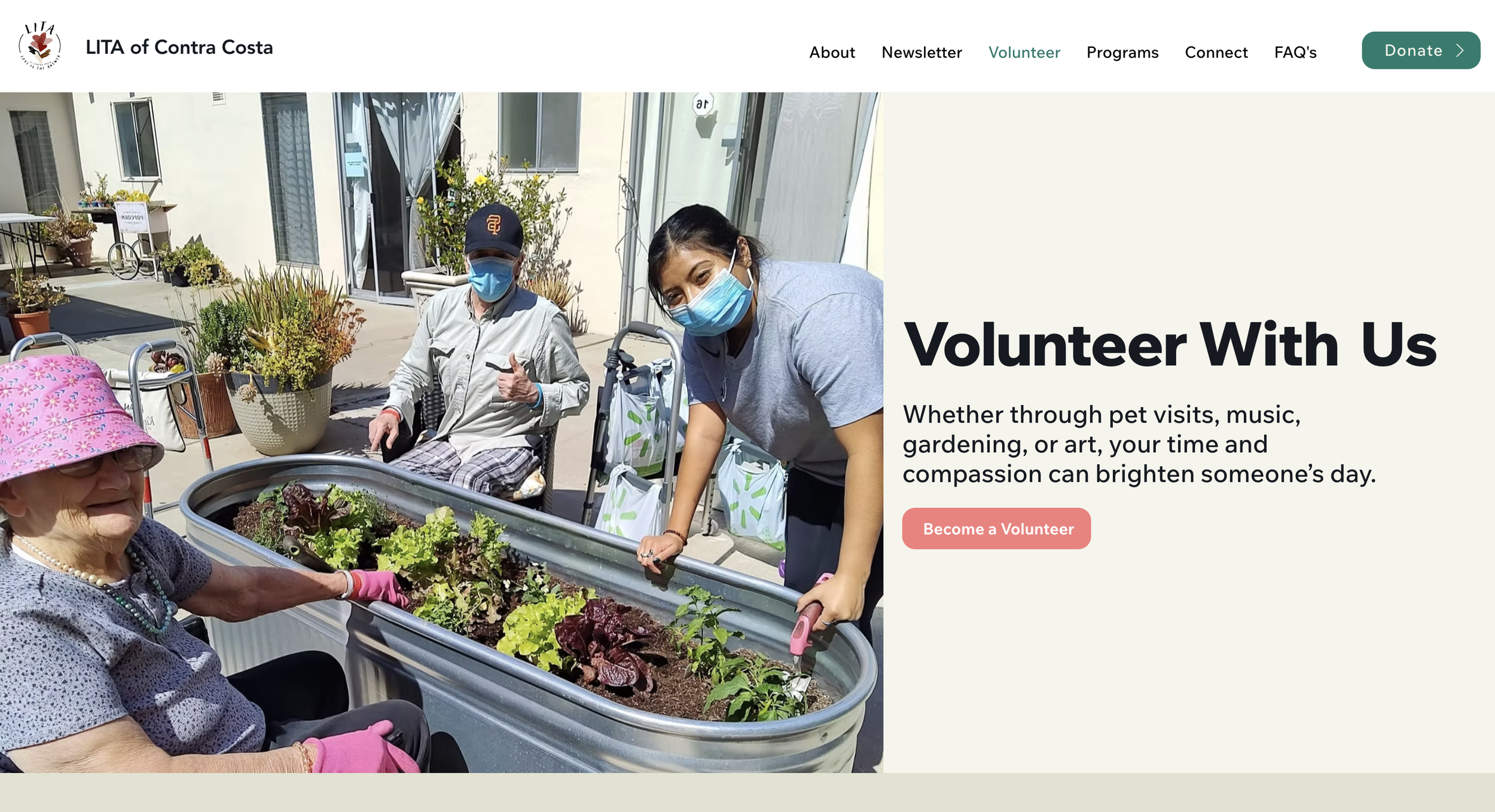
2) Clear Volunteer Journey With Less Decision Fatigue
The volunteer experience needed to feel welcoming and simple. We redesigned the volunteer flow by: Simplifying page layout and content groupingImproving headings and scannabilityCreating clearer next steps for sign-up or inquiryHighlighting volunteer opportunities without overwhelming users
This made volunteering feel easier to start, even for first-time visitors.
Volunteer Page Before Redesign
Volunteer Page After Redesign
3) Donation Experience Designed for Trust
Many nonprofit users hesitate before donating, especially if the experience feels unclear or unsafe. To build confidence, we improved the donation flow by:Creating a cleaner layout with fewer distractionsImproving CTA visibility and placementOrganizing content into clearer sections for faster scanningReducing steps and uncertainty during the donation process
The redesign made donating feel more secure, straightforward and intentional.
Donation Page Before
Donation Page After
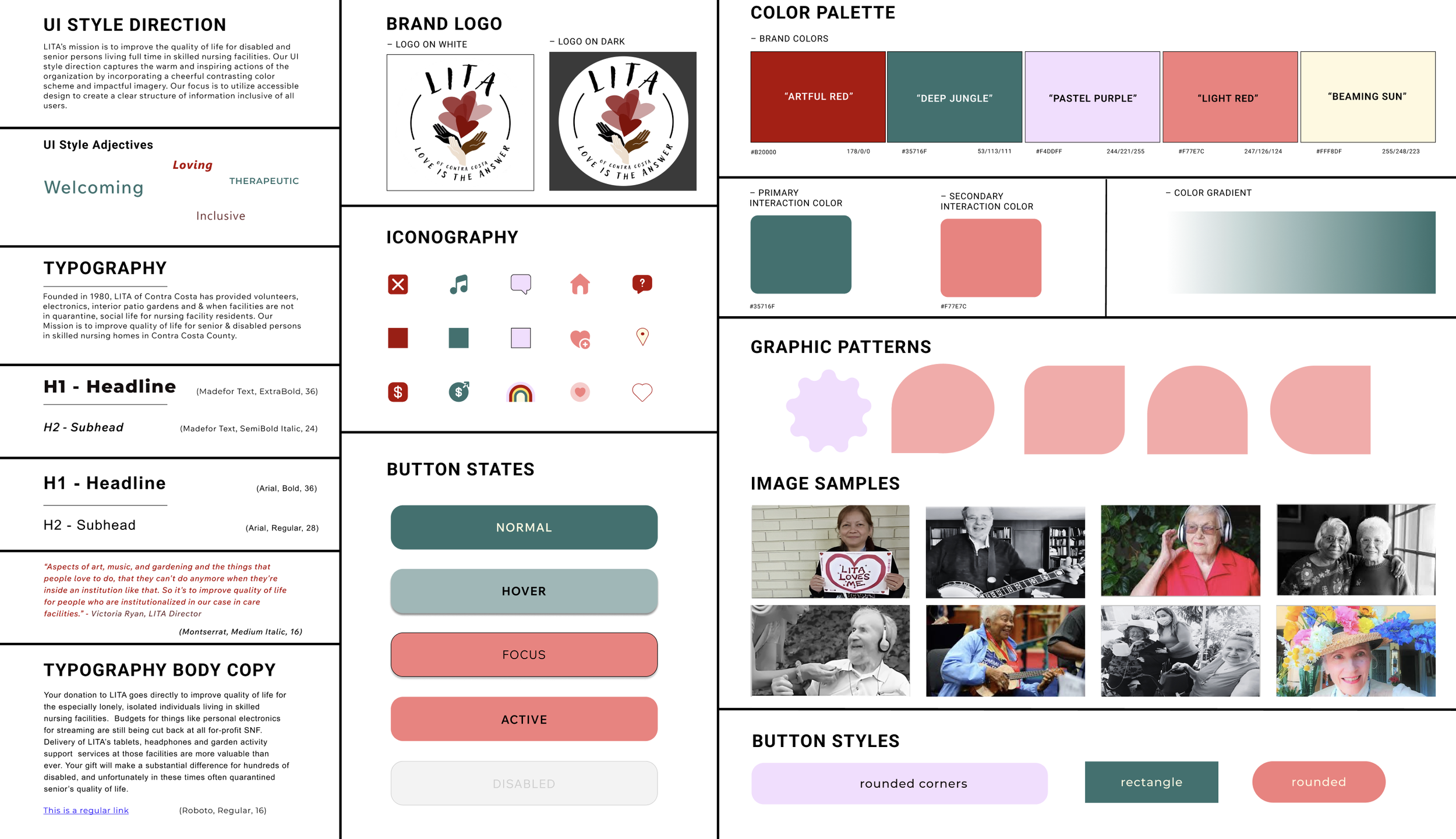
4) Accessibility + Visual Hierarchy Improvements
To support readability and inclusive design, we refined:Typography sizing and spacing for easier scanningConsistent button styles and interaction clarityStronger contrast and visual hierarchyLayout spacing to reduce clutter and cognitive overloadResponsive behavior across screen sizes
These changes improved the overall usability and made key actions more visible.
UI Style Tile
Usability Testing & Iterations
After building the redesigned prototype, we ran usability testing to validate improvements and identify remaining friction.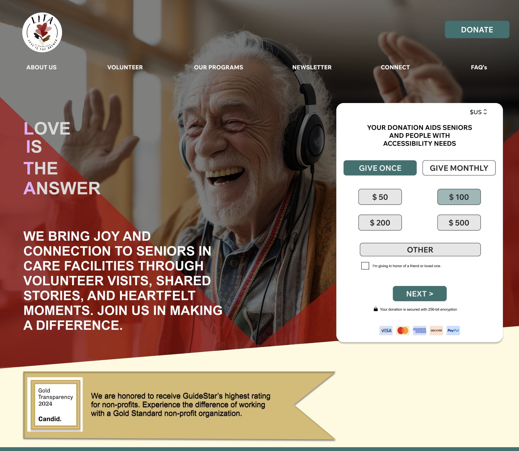
Before Feedback
Before usability testing, users struggled with: Difficulty identifying the primary action on the homepage.Low confidence in donating because trust signals were limited or hard to find.Cognitive overload caused by multiple competing CTAs and dense content Challenges scanning information quickly due to weak visual hierarchy.A cluttered navigation menu that made it harder to understand where to go next.A separate donation page that interrupted the user flow and added unnecessary steps.An overall homepage experience that felt visually heavy and harder to process
Based on usability feedback, we made the following improvements:Clarified the primary CTA through improved placement, contrast and button labelingStrengthened trust by adding a dedicated “Trust Earned” section highlighting LITA’s Gold Seal of TransparencySimplified the navigation menu to reduce cognitive load and improve wayfindingRemoved the standalone donation page and integrated donation actions more seamlessly into the main user journeyReordered homepage sections to improve flow, scannability and readabilityReduced content density and visual clutter to create a calmer, more approachable experienceImproved overall hierarchy to help users quickly understand key messages and take action
After Feedback
This iteration helped ensure the final design felt clearer, more structured and easier for users to take action with confidence.
Results & Impact
148% ↑
Volunteer sign-ups
189%
Faster Donation Completion Time
85%
Task success rate (key flows)
Based on live A/B testing + usability testing across key tasks.
After launching the redesign, the experience created a clearer path for first-time visitors by improving:Mission clarity within secondsNavigation to key actions (Volunteer / Donate)Trust and confidence to complete donationsMobile readability and usability
What improved
Final Deliverables
High-fidelity responsive prototypeRedesigned homepage, volunteer flow and donation flowUpdated navigation and improved information hierarchyDeveloper-ready screens and handoff assets

Reflection
This project reminded me how valuable it is to reevaluate design decisions as they come to life in development. What looked strong in our mock-ups didn’t always translate into the smooth, engaging experience we wanted, so we had to adjust and refine along the way. Simplifying flows like sign-ups and donations showed me how even small changes can make a big impact. More than anything, I learned that flexibility, feedback and iteration are what bring a design closer to both user needs and organizational goals.Future Outlook
This project strengthened my ability to lead a user-centered design process from discovery through final delivery. Now that the case study is part of my portfolio, it stands as an example of how I translate research insights into thoughtful, high-impact design decisions. Moving forward, I am eager to apply these skills to new challenges and continue growing as a designer who builds meaningful and accessible digital experiences.Every project is a chance to listen, learn and build solutions that make a real difference.
References & Acknowledgements
I would like to extend my heartfelt thanks to everyone who contributed to this project.To my team at Studio Mylo, thank you for your collaboration, creativity and support throughout each phase of the design process. Your teamwork and thoughtful input made this project both productive and rewarding.To stakeholder Victoria Ryan, thank you for your valuable input, direction, and thoughtful feedback, which were crucial in shaping the vision and success of this project.To all the users who participated in interviews, surveys, and testing sessions, thank you for generously sharing your time and perspectives. Your input was invaluable in creating user-centered solutions and driving meaningful design decisions.This project also drew inspiration from industry-leading resources, including Nielsen Norman Group articles, books such as Design Thinking, Lean UX, and The Design of Everyday Things, and design tools like Figma, Adobe Creative Suite, and Canva, all of which continue to shape my approach to user experience design.This project would not have been possible without each of you.Done Scrolling? Not Yet 😉
Take a peek at more of my design adventures below.